Guided Interaction in User Onboarding
How to provide the right level of onboarding guidance without creating dependence
Turn insights into action with the Persuasive Patterns card decks
Master the science behind user motivation and create products that drive behavior.
Get your deck!Most product teams assume that when users struggle during onboarding, the answer is to add more guidance.
More product tours. More tooltips. More checklists. More walkthroughs. More videos. More explanations. More hints pointing users toward the next step.
Sometimes that helps.
If a user does not understand what a product does, an empty state can clarify the opportunity. If a user does not know what to do next, a guided setup flow can create direction. If a user is likely to make a mistake, inline feedback can prevent frustration before it happens. Guidance can reduce uncertainty, lower effort, and help users move through moments where their capability is not yet strong enough to proceed independently.
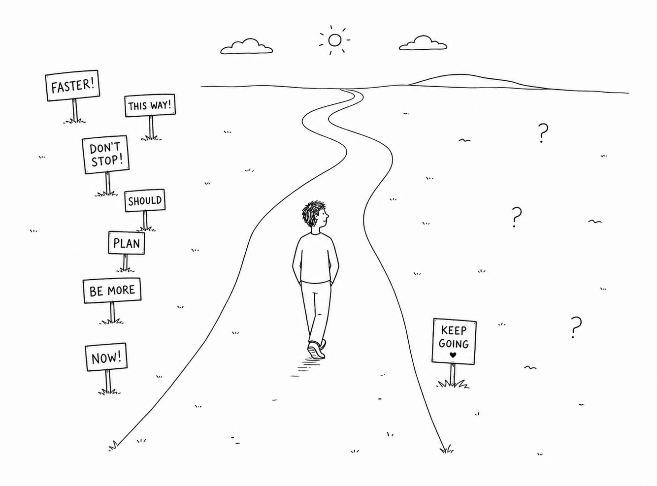
But guidance also has a cost.
Every piece of guidance changes the user’s relationship to the product. It can help the user understand, but it can also interrupt. It can create confidence, but it can also create dependence. It can reduce uncertainty, but it can also remove freedom. It can help beginners move forward, but it can make experienced users feel slowed down, constrained, or treated as if they are still new.
This is the guidance paradox.
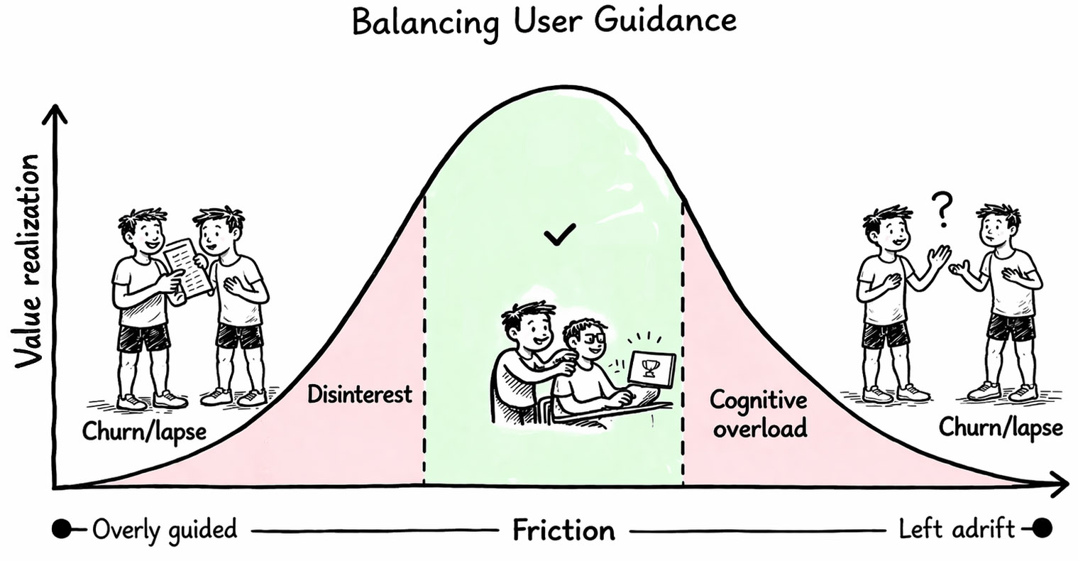
Too little guidance leaves users helpless. Too much guidance makes the product restrictive. Somewhere between those two extremes is the amount of help that supports action without taking over the experience. Krys Higgins captures this well in the idea of guided interaction: the goal is not to decide whether guidance is good or bad, but to find the point where the user has enough support to move forward and enough freedom to remain in control.
That distinction matters because onboarding is often treated as if guidance is something to add when users struggle. But guidance is not a layer placed on top of onboarding. It is one of the main ways onboarding shapes behavior. It determines how much the product explains, how much it directs, how much it constrains, and how much it asks users to figure out on their own.
Viewed through the MCC model, the question is not “Should we guide the user?” The better question is: “How much guidance does this user need in this moment, given their motivation, capability, and context?”
A highly motivated user with low capability may welcome explicit guidance. A capable user with little time may need a shortcut rather than an explanation. A curious user with weak motivation may need a low-commitment path into value. A user who has already completed the same task several times may need guidance to disappear.
Good onboarding is therefore not about maximizing guidance. It is about matching guidance to the user’s current state, then reducing that guidance as the user becomes more capable.
The goal is not to keep users guided.
It is to help them become independent.
Guidance should build independence
In the MCC model, capability describes what the user can do in the current moment. It includes knowledge, confidence, familiarity, skill, and understanding. When capability is low, the user may want to act but not know how. When capability grows, the same user can complete larger and more complex actions with less support.
Guidance exists because capability is not fully developed yet.
A beginner entering a product for the first time often needs explicit direction. They do not yet understand the structure of the product, the meaning of the interface, or the sequence of actions that leads to value. They may not know what matters, what can be ignored, what is optional, or what will happen after they click. In that state, guidance reduces uncertainty. It narrows the number of possible actions and makes the next step easier to choose.
But the same guidance becomes less useful as capability grows.
A tooltip that was helpful the first time may become noise the fifth time. A wizard that made the first setup easier may become frustrating once the user understands the structure. A product tour that felt useful during evaluation may feel like friction when the user returns with a specific task to complete.
This is why static guidance often fails. It assumes that the user’s capability remains fixed.
But users move through a sequence of moments. Their knowledge grows, their confidence changes, their attention varies, and their goals become more specific. The amount of guidance that fits one moment may not fit the next.
I’ve earlier argued that each action should fit the user’s current capability and slightly increase it for the next moment. The same principle applies to guidance. Each guided interaction should help the user rely slightly less on guidance the next time.
This gives guidance a different purpose.
The purpose of guidance is not merely to get the user through the current step. It is to increase the user’s ability to handle future steps with less help.
This matters because one of the biggest mistakes in onboarding is optimizing for completion instead of independence. Completion is easy to measure. The user finished the tour. The user completed the setup checklist. The user imported their data. The user reached the dashboard. The user clicked through the required steps.
These are useful signals, but they can also be misleading.
A user can complete a guided flow without understanding the product. They may follow instructions without forming a mental model. They may accept defaults without knowing what choices were made. They may reach the end of onboarding without knowing what to do next. From the product’s analytics, this can look like success. From the user’s perspective, it can feel like being escorted to the middle of a room and then left alone.
Good onboarding should produce more than completion. It should produce orientation, confidence, and independence.
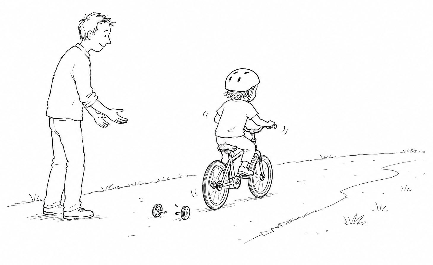
This is why the best metaphors for guidance are temporary structures. Training wheels help a child feel enough stability to start riding, but they are not the goal. Scaffolding supports construction, but it is removed once the building can stand on its own. A driving instructor gives direction, feedback, and reassurance, but the student eventually needs to drive without them. GPS navigation helps someone reach a destination, but if the person never learns the surrounding streets, the guidance can reduce navigation to compliance.
Each of these systems exists to disappear.
Onboarding guidance should work the same way.
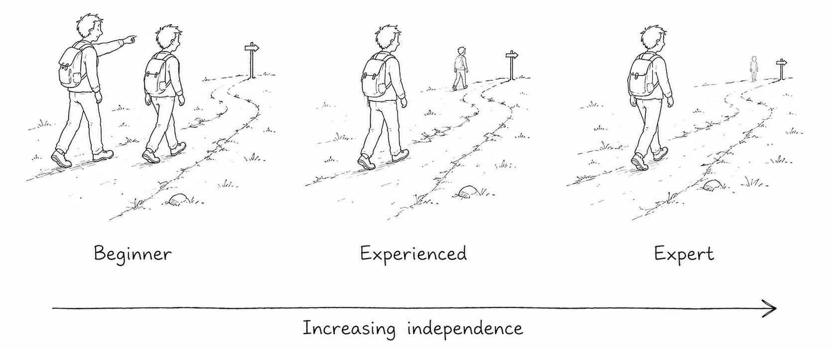
The more capable the user becomes, the less visible the guidance should be. The product should not continue treating the user as a beginner long after they have developed competence. Persistent guidance can become a signal that the product does not recognize the user’s progress. It can also reduce the user’s sense of autonomy by constantly telling them what to do.
A guided interaction succeeds when the user no longer needs that same guidance in the same situation.
Three kinds of guidance
Guidance is often discussed as if it were a single thing. A team might say, “We need more onboarding,” and then add a tour, a tooltip, a checklist, an empty state, or a help article. But these patterns guide users in different ways. They solve different problems. They also create different risks.
A useful way to think about guidance is to separate it into three types: information guidance, action guidance, and decision guidance.
Information guidance helps users understand. It answers questions like: What is this? Why does it matter? What will happen if I continue? Empty states, tooltips, inline hints, examples, documentation, and explanatory copy all belong here. They reduce uncertainty by giving the user more context.
Information guidance is useful when users are willing to act but do not understand the environment well enough to proceed. A new user looking at an empty dashboard may not know whether the product is broken, incomplete, or waiting for input. A good empty state can explain what belongs there, why it matters, and how to create the first useful object. A user facing an unfamiliar field may need an example of the expected input. A user about to take a risky action may need reassurance about what will happen next.
But explaining more does not always make action easier. Sometimes more explanation increases the burden on the user. It turns a simple action into a reading task. It can also create the illusion of support without reducing the difficulty of the action itself.
Action guidance helps users perform. It answers questions like: What should I do next? In what order? How do I complete this safely? Wizards, guided setup flows, product tours, progressive disclosure, and checklists are forms of action guidance. They reduce uncertainty by shaping the path.
Action guidance is useful when the sequence matters, when the cost of error is high, or when the user is unlikely to succeed by exploration alone. A setup wizard can help users configure a complex system. A checklist can create momentum across multiple required tasks. Progressive disclosure can prevent users from confronting the full complexity of a product before they are ready.
But the more strongly the product directs the user, the more it constrains them. A wizard can simplify setup, but it can also force all users through the same order. A product tour can introduce the interface, but it can also interrupt a user who already knows what they came to do. A checklist can create progress, but it can also reduce onboarding to compliance if the tasks do not clearly connect to value.
Decision guidance helps users choose. It answers questions like: Which option should I pick? Which path is best for me? What is the recommended next step? Smart defaults, suggested actions, templates, recommended workflows, and recommended next steps belong here. They reduce uncertainty by narrowing choices.
Decision guidance is often the most powerful form of guidance because it does not merely explain the product or direct the sequence. It helps the user make a better decision. A smart default can reduce effort and increase confidence. A template can make a blank page less intimidating. A recommended next step can help users avoid decision paralysis. A suggested starting point can help users begin without having to understand the full product landscape first.
But decision guidance also carries risk. The stronger the recommendation, the more responsibility the product takes on. Bad defaults, poorly timed suggestions, or overconfident recommendations can reduce user autonomy. They may lead users down a path that benefits the product more than the user. They may also prevent users from learning how to make good decisions themselves.
Information guidance helps users understand. Action guidance helps users proceed. Decision guidance helps users choose. Good onboarding often combines all three, but the right balance depends on the user’s current motivation, capability, and context.

Choosing the right amount of guidance
The right amount of guidance is not determined by the product. It is determined by the user’s current state.
A common onboarding mistake is to design one level of guidance and apply it to everyone. Every user gets the same tour. Every user sees the same checklist. Every user receives the same empty state, the same prompts, the same tooltips, and the same reminders.
This is simpler to design, but it rarely reflects reality.
Different users arrive with different motivation. Some have a clear goal and urgency. Others are casually exploring. Some are skeptical. Some are already persuaded. Some were invited into the product by someone else and do not yet understand why they are there.
Different users also arrive with different capability. Some understand the domain well but not the product. Others understand the product category but not the specific workflow. Some have used similar tools for years. Others are encountering the entire category for the first time.
And different users arrive in different contexts. One user may have thirty focused minutes. Another may be on a phone between meetings. One may have all required information ready. Another may be interrupted, distracted, or uncertain whether they are allowed to continue.
These conditions should change how guidance behaves.
A user with high capability and high motivation usually needs minimal guidance. They know what they want, and they are able to act. Too much guidance slows them down. For this user, onboarding should remove obstacles, make advanced paths accessible, and avoid interrupting momentum.
A user with low capability but high motivation needs guided action. They want to proceed but do not yet know how. This is where examples, wizards, inline help, progressive disclosure, and structured setup can be useful. The designer’s task is to preserve motivation by making the next step achievable.
A user with high capability but low motivation does not need more instruction. They may understand the product but not yet care enough to continue. In this case, guidance should reconnect the product to value. Show what can be achieved. Reduce the cost of trying. Use examples that reflect the user’s goal. Give them a reason to invest attention.
A user with low capability and low motivation is the hardest case. More guidance alone may not help because the user is not yet convinced the effort is worthwhile. The experience must reduce effort and clarify value at the same time. The first action should be small, low risk, and directly connected to a meaningful outcome.
Context changes the answer again. A user with little time may not need a tour. They may need a smaller action. A user with interrupted attention may need saved progress and an easy return path. A user working through a high-stakes decision may need reassurance, examples, reversibility, and clear feedback.
This is why the question “How much guidance should we provide?” is incomplete.
The better question is: “What kind of help would make action more likely in this moment?”
Sometimes the answer is explanation. Sometimes it is structure. Sometimes it is a recommendation. Sometimes it is a smaller task. Sometimes it is no guidance at all.
Guidance works when it matches the active constraint.
Choosing the right UI pattern
Because guidance has different jobs, onboarding UI patterns should not be chosen by popularity. They should be chosen by the kind of help the user needs.
A product tour is not a universal onboarding solution. Neither is a tooltip, checklist, wizard, empty state, video, or help center. Each pattern provides a different level of guidance and imposes a different cost on the user.
High-guidance patterns are useful when the user needs structure. Wizards, guided setup flows, product tours, and progressive disclosure can reduce complexity by shaping the path. They are especially useful when the task has dependencies, when errors are costly, when the user has low capability, or when the product needs to help the user move through an unfamiliar process.
But high-guidance patterns should be used carefully. A guided setup flow can help a user configure an account, but it can become restrictive if it forces all users through the same sequence. A product tour can orient a new user, but it can become ineffective if it explains features before the user has a reason to care. Progressive disclosure can reduce complexity, but it can also hide information that some users need earlier.
Medium-guidance patterns support users without fully controlling the path. Empty states, suggested actions, smart defaults, inline hints, examples, and contextual help allow the user to remain in the product environment while receiving enough help to continue.
These patterns are especially useful when the user has some capability but still needs support. An empty state can help a user understand what to do with a blank screen. A suggested action can offer a next step without requiring it. A smart default can help users move forward while leaving room for adjustment. Inline hints can explain the moment of action rather than forcing users into a separate tutorial.
Low-guidance patterns are useful when users are capable enough to seek help on their own. Search, help centers, documentation, and on-demand assistants give users control over when to receive support. These patterns respect autonomy because they do not interrupt the user unless the user asks for help.
But low-guidance patterns assume that the user knows what to ask for. Documentation is useful only when users can identify their problem. Search works only when users know the right words. Help centers are useful only when users have enough motivation and time to leave the task and look for answers.
This is why the strongest onboarding systems often combine patterns. A new user might begin with an empty state that explains value, a suggested action that reduces choice, a smart default that lowers effort, and inline feedback that helps them complete the first step correctly. Later, as capability grows, those same users may need only documentation, keyboard shortcuts, or optional advanced guidance.
The pattern is not the strategy.
The strategy is matching the level of guidance to the user’s current state.
Guidance should adapt
In the chapter on adaptive onboarding, I argued that onboarding should respond to the user’s current moment rather than force everyone through the same predefined path. Guided interaction is one of the clearest places where this principle matters.
Traditional onboarding gives everyone the same guidance. The same product tour appears regardless of the user’s goal. The same checklist appears regardless of capability. The same tooltip appears regardless of whether the user is confused, rushed, or already experienced.
Adaptive onboarding behaves differently.
It observes behavior, identifies the likely constraint, provides guidance, and then removes or changes that guidance when the constraint changes.
A user who repeatedly hesitates may need an example. A user who repeatedly makes the same mistake may need stronger feedback. A user who completes several similar tasks successfully may need hints to disappear. A user who skips the tour and immediately completes the main action may need freedom rather than instruction. A user who starts a task and leaves may need a saved state and a return path, not more explanation.
This is where guided interaction connects directly to the MCC model. The same surface behavior can have different causes. A user pausing on a screen may be confused, interrupted, skeptical, or simply reading carefully. A user skipping guidance may be confident, impatient, or unaware that help exists. A user abandoning a flow may lack motivation, capability, or context.
Good guidance should therefore be responsive but careful. It should not assume too much from a single signal. It should offer support in ways that preserve choice. It should help without taking control away.
For example, instead of forcing a user into a tour after detecting hesitation, the product might reveal a short example, offer a “show me how” option, or make the next step clearer. Instead of keeping all hints visible forever, the product might hide them after repeated success while still making help available on demand. Instead of treating all errors as the same, the product might distinguish between formatting mistakes, conceptual misunderstandings, and missing information.
Adaptive guidance is not about making the product more talkative.
It is about making help more relevant.
The best guidance appears when it is useful and disappears when it is not.
Guidance should fade
One of the clearest signs of poor onboarding is guidance that never disappears.
A checklist stays visible long after the user understands the workflow. A tooltip appears every time the user returns to a screen. A product tour keeps nudging experienced users toward actions they already know how to perform. A help panel occupies permanent space even though it was only needed during the first few sessions.
This creates a strange experience. The product behaves as if the user has not learned.
Guidance that never fades can make a product feel heavier over time. It competes with the task the user came to complete. It can also signal that the product does not recognize progress. The user has become more capable, but the interface has not changed in response.
Good onboarding should become quieter as capability grows.
This does not mean help disappears completely. It means guidance becomes more contextual, optional, and lightweight. Early in onboarding, the product may provide more visible support. Later, guidance can move into inline affordances, optional help, documentation, advanced tips, or contextual assistance that appears only when needed.
Progressive disclosure works partly because it respects this principle. It does not show everything at once. It reveals complexity as the user becomes ready for it. Contextual help works because it ties guidance to the moment of need rather than placing instructions everywhere. On-demand assistance can work because it allows users to request guidance without forcing every user into the same explanation.
The product should gradually shift from instruction to support.
In the beginning, guidance may need to lead. Over time, it should accompany. Eventually, it should mostly stand aside.
This fading process matters because it reinforces autonomy. Users feel progress not only when they complete tasks, but when the product trusts them to continue with less help. As guidance fades, the user’s confidence becomes more visible to them. They no longer need the same prompts. They no longer require the same reassurance. They can act because they understand.
That is one of the deeper goals of onboarding.
Not just to help users complete an action, but to help them notice that they have become capable.
Guided interaction through the MCC model
Guided interaction is a practical application of the MCC model.
Motivation, capability, and context determine what the user is able and willing to do in a given moment. Guidance changes the experience by acting on those variables.
When capability is low, guidance can make the next action understandable and achievable. Examples, defaults, guided setup, and feedback all reduce the amount of knowledge required to proceed. When capability is high, guidance should decrease and autonomy should increase. Experienced users do not need the same explanations as beginners. They need speed, flexibility, and access to more advanced paths.
When motivation is low, guidance should reconnect the product to value. More instruction is rarely enough. The user needs to understand why the effort is worth it. Empty states, examples, suggested outcomes, and low-commitment entry points can help motivation grow.
When context is limited, guidance should reduce the size of the action. A user with little time or attention may not need a tutorial. They may need a smaller step, a saved state, a clear return path, or a way to defer complexity until later.
This is why guidance should not be decided once during design and then applied uniformly. Guidance should reflect the user’s current state. It should help when help is needed, get out of the way when it is not, and gradually build the user’s ability to act independently.
The central question is not:
“How do we guide users through onboarding?”
It is:
What kind of guidance fits this user, in this moment, so that they become more capable next time?
That question keeps guidance connected to behavior rather than interface decoration.
Guidance is temporary
The purpose of onboarding is not to guide users forever.
It is to help users become capable enough that the same guidance is no longer needed.
This is why guided interaction requires restraint. It is tempting to add more help whenever users struggle. Sometimes that is the right move. But more guidance can also hide the real problem. The user may not need another tooltip. They may need a clearer value proposition, a smaller first action, a better default, a safer way to experiment, or a product that recognizes they have already learned.
The best onboarding systems become quieter over time.
They help users move from confusion to orientation, from orientation to action, from action to understanding, and from understanding to autonomy.
- They replace support with confidence.
- They replace instruction with understanding.
- They replace guidance with capability.
Because successful onboarding is not measured by how much guidance the product provides, but by how little guidance users eventually need.
- Guided Interaction by Krys Higgins
- Onboarding Tutorials vs. Contextual Help by Page Laubheimer
- User Onboarding: Designing Empty States for Mobile Apps by Nick Babich
- How We Built Product Tours by Intercom
- Designing Better Tooltips For Mobile User Interfaces by Vitaly Friedman
- Onboarding UI Patterns by Anders Toxboe
- Higgins, K. (2018). Better onboarding. Rosenfeld Media.
- A Behavioral Model of User Onboarding by Anders Toxboe at Learning Loop
- User Onboarding Beyond Day One by Anders Toxboe at Learning Loop
- The End of Static User Onboarding by Anders Toxboe at Learning Loop
- Norman, D. A. (2013). The design of everyday things (Revised and expanded edition). Basic Books.
- Deci, E. L., & Ryan, R. M. (1985). Intrinsic motivation and self-determination in human behavior. Plenum.