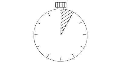
How: When first impressions count, use a five second test. Ask people what they recall after seeing something for five seconds. When the time is up, remove the object and ask users to recall what stood out the most in that brief amount of time, and why.
Why: Five second tests help pinpoint initial impressions on layout design, information architecture, and content. They can help optimize the clarity of your designs by measuring first impressions as well as validate whether the impression you wish to leave is actually being absorbed in the memory of users. Was the value proposition understood, did the most important keywords stick, or do users immediately understand what you are selling?
Five-second testing is a user research method designed to capture a user’s first impression of a design within a brief period. This technique involves showing a design to participants for five seconds and then asking them questions to gauge their immediate reactions and understanding. The aim is to quickly identify usability issues and optimize the initial impact of a product.
The rationale behind using exactly five seconds stems from the belief that it is a sufficient amount of time for users to form an initial impression without over-analyzing. However, this time frame is not universally optimal. The method works by avoiding speculative feedback that may arise from longer exposure times.
Research indicates that various factors influence the effectiveness of five-second tests, such as the participant’s cognitive abilities and the visual complexity of the design. For instance, participants with high perceptual speed and working memory can process information quickly, making even shorter tests feasible. Conversely, those with lower cognitive abilities might require more time to form meaningful impressions.
Five-second tests are particularly useful for testing landing pages or interfaces designed for immediate comprehension. However, they are less effective for multi-purpose interfaces that require users to interact with various elements. In such cases, full usability testing is more appropriate.
Testing recall through recognition
Showing a design, a logo, a photograph, or something completely different for a short period of time (5 seconds seems to be the norm), hiding it, and then asking users to recall what they saw from a multiple choice list, can help test comprehension. Do people comprehend what you thought they would after seeing a design? What does a logo or product name remind them of? Can they find the call-out to action and what did it say?
Testing websites
We tend to make initial judgements about websites within the first five seconds of visiting it. Possible things to test with a five second test could be:
- Do key navigation features stand out (are they remembered)?
- Do call-to-action buttons stand out and can participants remember what the call-out was?
- What did the color-scheme remind them of? A Bank? A flowershop? A cutting-edge startup?
Early-stage testing
The Five Second Test can be used for more than testing an actual solution. In fact, it shines at testing comprehension of short messaging. It could be your value proposition, whether users can connect your product name with the problem you’re trying to solve, or whether the logo you have created conveys the values you intended.
As a rule of thumb, a goal comprehension rate is 80%. That is, once 80% of your users respond with the answers you first intended them to answer, you have a match.
Why use the Five second test for product research?
The focus of the 5 second test is on evaluating users’ initial impressions of a design, product, or key message.
It is a valuable tool for assessing first impressions, crucial in environments where users make rapid decisions based on initial perceptions. This testing method is particularly useful for evaluating the effectiveness of web pages, product interfaces, or advertisements in conveying their primary message or value proposition quickly and effectively.
By focusing on recall accuracy, alignment of recalled elements with objectives, and understanding the reasons behind what participants remember, designers and marketers can refine their creations to better capture and hold user attention, ensuring that key messages are not only seen but also remembered.
How to set up a good 5-second test
The complexity of the design being tested plays a critical role in how the results will pan out. Simple designs may not require the full five seconds for users to form impressions, while complex designs might necessitate longer exposure to ensure users can process the information adequately. Therefore, adjusting the viewing time based on the design’s complexity and the target audience’s cognitive abilities is recommended.
Popular questions for 5-second test
Attitudinal questions, where participants rate qualities like attractiveness or clarity, often yield consistent results regardless of the exposure time. This suggests that initial attitudes towards a design can crystallize very quickly. However, for more detailed feedback, such as recalling specific elements or identifying the purpose of a website, a longer exposure time can be beneficial.
Frequently used questions for 5 second tests are:
- “What do you think this page is about?”
- “What product do you think this business is offering?”
- “What do you remember most about the page?”
- “Can you recall the company or product name?”
- “What is the main thing you can recall?”
Popular tools
The tools below will help you with the Five Second Test play.
-
FiveSecondTest.com
Optimize the clarity of your designs by measuring first impressions and recall.
Real life Five Second Test examples
LogMeIn
The remote computer repair company, conducted the Five Second Test on different versions of a safety warning popup. The test results showed that one version communicated the message 5.5 times more effectively than the others, guiding them in selecting the most effective design.
United Consult
For the home page of United Consult, which aimed to attract new talents, the Five Second Test was used to decide between slightly different background images. The test provided objective feedback on which image best communicated the company’s corporate values and atmosphere.
TeeArena
The web-shop for t-shirts, the Five Second Test was employed to evaluate whether their logo effectively communicated the dual aspects of t-shirts and fighting. The test helped in choosing symbols that best represented TeeArena’s brand identity.
A collection of 60 product experiments that will validate your idea in a matter of days, not months. They are regularly used by product builders at companies like Google, Facebook, Dropbox, and Amazon.
Get your deck!Related plays
- Five Second Test by UsabilityHub
- 5-Second Test by Pidoco

