Persuasive Patterns: Influence
Curiosity Effect
We crave more when teased with a small bit of interesting information
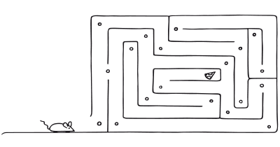
The “Curiosity Effect” refers to the psychological phenomenon where individuals are driven to seek out new information and experiences due to their innate desire to fill knowledge gaps.
Imagine you’re browsing through a bookstore, and you come across a book with an intriguing cover. The title is obscured, and there’s a tagline that reads, “The secret that changed history.” You’re immediately curious. What could this book be about? What’s the secret? Even though you had no intention of buying a book that day, your curiosity is piqued, and you feel compelled to pick up the book and explore its contents (Sirianni, 2016).
Now, think about a time when you were scrolling through a streaming platform looking for a movie or series to watch. You come across a thumbnail of a show with an intriguing image, but the title and description are hidden, only revealing a teaser like “The twist you won’t see coming.” Even though you had a list of shows you planned to watch, this teaser sparks your curiosity. You click on it, eager to find out more.
The research by Lavoie and Main (2022), demonstrates that curiosity can be evoked using product information or a preview of the content, and can vary based on individual differences in openness to experience.
Waiting sparks curiosity and memory retention
In the late 1960s, a study was conducted where participants were presented with trivia questions. While some participants were given immediate answers, others were made to wait. The waiting group reported 42% higher levels of curiosity and, interestingly, 28% better retention of the information once they received the answers. This simple experiment demonstrated the power of the “information gap” - the space between what we know and what we want to know - and how it can stimulate curiosity.
Loewenstein, G. (1994). The psychology of curiosity: A review and reinterpretation. Psychological Bulletin, 116(1), 75-98.
The Curiosity Effect is rooted in the human drive to close the “information gap.” This gap arises when there’s a difference between what we know and what we want to know. The greater the gap, the stronger the desire to seek out the missing information.
Humans have an inherent desire to understand the world around them. This drive, often termed the “Curiosity Effect,” compels individuals to explore, inquire, and delve deeper into unknown territories. Whether it’s clicking on a mysterious headline or exploring a new app feature, this pattern leverages our natural inclination to seek answers and unravel mysteries.
Curiosity is not just about the pursuit of new knowledge or experiences. It’s also about bridging gaps in one’s understanding, making it a powerful tool for designers. This drive to explore the unknown and resolve uncertainty can be categorized into two primary types:
- Diversive, which seeks novelty. It’s the initial spark of interest, the superficial allure of the new. In design, this could translate to introducing fresh aesthetics or novel interactive elements that capture immediate attention.
- Specific, which pursues a particular piece of information. It’s what keeps a user hooked, making them dive deeper into the product. For instance, a user might want to explore a particular feature in depth or understand a specific topic exhaustively.
Recognizing the type of curiosity that a target audience predominantly exhibits can significantly influence design decisions. If user engagement is a goal, curiosity can be used as a dialogical tool, promoting exploration and questions. Moreover, on social platforms or community-driven sites, the role of curiosity extends beyond mere exploration. It aids in the development of intimate relationships, fostering deeper connections between users.
The benefits of stimulating curiosity are not just psychological but also neurological. When users are curious, their memory retention improves. This enhancement is attributed to the activation of the brain’s reward circuitry during states of curiosity. We remember rewards, why designs that stimulate curiosity can potentially enhance user learning.
However, while the drive to seek information is strong, designers should also be aware of the phenomenon of information avoidance. Not all users will be inclined to explore every piece of content or feature. Some might even avoid information that conflicts (creates Cognitive Dissonance) with their beliefs or induces negative emotions. This balance between seeking and avoiding information becomes especially relevant in retail environments. Here, the element of mystery, revealing just enough to pique interest but not everything, can be a potent tool to drive purchase motivation.
The relationship between curiosity and the state of flow in users is worth noting. When combined with openness and the right information valence, curiosity can lead users into a state of flow, resulting in more immersive and engaging product trials.
Designing products with the Curiosity Effect
The Curiosity Effect capitalizes on our innate desire to explore the unknown and bridge the gap between our current understanding and the concealed mysteries that beckon us.
To effectively utilize this pattern, designers need to be subtle. Begin by offering just enough information to intrigue but not so much that it satisfies the user’s curiosity immediately. This balance ensures a sustained engagement. Use a gradual reveal strategy; unveiling features or content progressively can make users feel like they’re on a journey of discovery.
Understanding the type of curiosity a target audience predominantly leans towards (diversive vs specific) can shape product design. For a platform aiming for widespread user engagement, stimulating diversive curiosity could be the initial hook. On the other hand, platforms aiming for sustained engagement or depth of content consumption might focus on catering to specific curiosity.
When users are in a state of curiosity, their brain’s reward circuitry is activated, enhancing memory retention. Such a state ensures that interactions or content consumed during this period have a higher likelihood of being remembered. For educational platforms or applications aiming for sustained learning, integrating design elements that consistently stimulate curiosity can boost understanding and information retention.
However, not every user wants to explore every nook and cranny all the time. In some situations, users might shy away from information that contradicts their beliefs or induces discomfort. This balance, especially in retail environments, is noteworthy. The balance is revealing just enough to intrigue but not so much that the mystery dissipates. It’s this equilibrium that can drive purchase decisions, as users are lured by the promise of the unknown.
When users are curious, and the design offers them the right balance of challenge and skill, they can enter a state of flow (see Flow Theory and Apporpriate Challenges). This state is characterized by deep immersion, where users lose track of time, engrossed in the product or platform. Such experiences not only ensure prolonged engagement but also foster a positive association with the product.
For users to engage their curiosity, they must trust the product or platform. Designers should aim to create interfaces that are transparent, consistent, and reliable:
- Understand your audience
Recognize which dimension of curiosity your target audience predominantly exhibits (diversive or specific). - Introduce surprises
Change is often a catalyst for curiosity. Introduce new features or updates periodically, but ensure they add value. - Reward engagement
When users take the time to explore, reward them. This could be through unlocking new features, providing additional content, or other incentives. - Balance information
While it’s essential to provide enough information to pique interest, there’s also a risk of information overload. Strive for a balance, revealing just enough to intrigue but not so much that it becomes overwhelming. - Prioritize trust
Users are more likely to explore a product or platform they trust. Ensure that your design is transparent, user-friendly, and reliable.
While curiosity is a powerful tool, it’s important to recognize its limits. Not all users will be inclined to explore every feature or piece of content. Some might even avoid information that conflicts with their beliefs or induces negative emotions. Designers should respect these boundaries, ensuring that users always feel in control of their journey.
The “Curiosity Effect” thrives on novelty. By consistently teasing users without offering substantial revelations, you risk breeding frustration. Over time, this can erode trust, as users might feel they’re being led on a perpetual chase without a satisfying end. It’s crucial to balance the act of sparking curiosity with meaningful content or features that reward the user’s investigative efforts.
Curiosity, by its nature, raises expectations. If, upon exploration, users don’t find value in what they discover, feelings of disappointment or betrayal can emerge. It’s akin to unveiling a beautifully wrapped gift box only to find it empty. Ensure that when you pique a user’s interest, the subsequent revelation aligns with their expectations and provides genuine value.
While a touch of mystery can intrigue users, making things overly complex or ambiguous can be counterproductive. If users find themselves lost in a maze of uncertainty, they might choose to abandon the product altogether. Strive for a balance between sparking interest and maintaining clarity. Remember, the goal is to guide users on a journey of discovery, not leave them stranded in confusion.
Ethical recommendations
A potential ethical danger when applying the Curiosity Effect in design lies in the overuse of curiosity-driven tactics, leading users on without ever providing meaningful revelations. This can result in diminished trust and a sense of frustration.
Another area of concern is deceiving or misleading users. If users are led to believe they will discover something of value and instead find content or features that are irrelevant or lack substance, they might feel deceived.
Resist the temptation to leverage curiosity to push users into decisions or actions that aren’t in their best interest. For example, pushing users to purchase a product or subscribe to a service without clearly communicating the implications or costs.
- Be transparent
Always be clear about what users can expect once their curiosity is satisfied. Avoid using misleading teases or hints that might not align with the actual content or feature. - Provide value
Ensure that when users’ curiosity is piqued and they decide to explore further, they find content or features that are meaningful and relevant. The revelation should always be worth the buildup. - User well-being first
Always prioritize the user’s well-being. Do not use the Curiosity Effect to push users into decisions or actions that might not be in their best interest. This includes avoiding pushing unnecessary purchases or subscriptions.
Real life Curiosity Effect examples
Goodreads
The book recommendation website occasionally sends emails with a title like “A book you might like…” This piques the curiosity of readers, encouraging them to log in and explore the recommendation.
Buzzfeed
Their articles often have intriguing headlines that don’t give away the entire story, compelling readers to click and read more.
When users receive a notification that someone has viewed their profile, they often only see a limited number of details about the viewer, encouraging them to upgrade to a premium account for full viewing rights.
Trigger Questions
- How can we offer just enough information to intrigue without revealing everything?
- In what ways can we ensure that every revelation provides genuine value to our users?
- How do we ensure we're ethically harnessing curiosity, prioritizing user benefits over mere engagement metrics?
- Are there areas in our product where users' curiosity isn't being satisfied, leading to potential frustration?
- How can we strike a balance between evoking curiosity and ensuring user clarity?
- Are there feedback mechanisms in place to gauge if users feel enriched or deceived by our design choices?
Pairings
Curiosity Effect + Scarcity Bias
By hinting that there’s limited information or access and combining it with a teaser, users are more compelled to act. An example would be a limited-time webinar with undisclosed expert speakers. Users would be curious about the speakers, and the time limitation would push them to register.

We crave more when teased with a small bit of interesting information

We value something more when it is in short supply
Curiosity Effect + Storytelling
Narratives often keep information back to maintain interest. For example, episodic content platforms like Netflix often leave cliffhangers at the end of episodes, combining the power of storytelling with the Curiosity Effect to keep viewers hooked.

We crave more when teased with a small bit of interesting information

We engage, understand, and remember narratives better than facts alone
Curiosity Effect + Peak-End Rule
When users are left with a strong final impression combined with a teaser about what’s coming next, they’re more likely to return. Consider the end-credits scenes in Marvel movies, which leave audiences both satisfied and curious about the next installment.

We crave more when teased with a small bit of interesting information
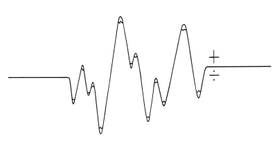
We judge an experience by its peak and how it ends
Curiosity Effect + Commitment & Consistency
When users start a journey driven by their curiosity, they are more likely to see it through if they’ve made even a small commitment. For instance, e-learning platforms might tease the content of an advanced course. Once a user commits by taking a beginner’s course, the platform can consistently tease more advanced content, motivating users to complete the entire learning path. An application such as Coursera might utilize this by showing the potential outcomes or advanced skills acquired after a course series, with a message like, “Complete the beginner’s course to unlock the secrets of advanced data analysis.”

We crave more when teased with a small bit of interesting information
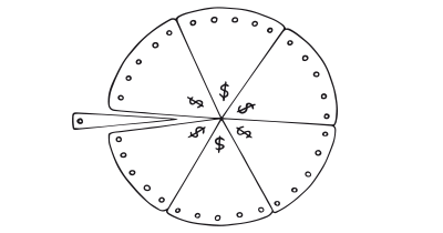
We want to appear consistent with our stated beliefs and prior actions
Curiosity Effect + Need for Closure
E-commerce platforms can offer a mix of familiar products (satisfying the need for closure) and periodically introduce new, innovative products (invoking curiosity). For example, a fashion e-commerce site might showcase its staple best-sellers while occasionally introducing limited-edition clothing lines inspired by current events or pop culture. The familiar items give shoppers a sense of comfort, while the limited-edition items pique their curiosity, leading them to explore more.�a�aWhen pairing the Curiosity Effect with other patterns, ensure that users aren’t left feeling overwhelmed or under-informed. For instance, while combining Scarcity and Curiosity might push users to act, it’s vital to provide enough information for them to make an informed decision.

We crave more when teased with a small bit of interesting information
We have a desire for definite cognitive closure as opposed to enduring ambiguity
A brainstorming tool packed with tactics from psychology that will help you increase conversions and drive decisions. presented in a manner easily referenced and used as a brainstorming tool.
Get your deck!- The psychology of curiosity: A review and reinterpretation by Loewenstein
- Supporting Early Scientific Thinking Through Curiosity by Jirout
- Loewenstein, G. (1994). The psychology of curiosity: A review and reinterpretation. Psychological Bulletin, 116(1), 75-98.
- Litman, J. A., & Spielberger, C. D. (2003). Measuring epistemic curiosity and its diversive and specific components. Journal of Personality Assessment, 80(1), 75-86.
- Kang, M. J., Hsu, M., Krajbich, I. M., Loewenstein, G., McClure, S. M., Wang, J. T., & Camerer, C. F. (2009). The wick in the candle of learning: Epistemic curiosity activates reward circuitry and enhances memory. Psychological Science, 20(8), 963-973.
- Walton, D. (2007). The three bases for the enthymeme: A dialogical theory. Journal of Applied Logic, 5(3), 427-449.
- Kashdan, T. B., & Roberts, J. E. (2004). Trait and state curiosity in the genesis of intimacy: Differentiation from related constructs. Journal of Social and Clinical Psychology, 23(6), 792-816.
- Gruber, M. J., Gelman, B. D., & Ranganath, C. (2014). States of curiosity modulate hippocampus-dependent learning via the dopaminergic circuit. Neuron, 84(2), 486-496.
- Golman, R., Hagmann, D., & Loewenstein, G. (2017). Information avoidance. Journal of Economic Literature, 55(1), 96-135.
- Kashdan, T. B., & Roberts, J. E. (2004). Trait and state curiosity in the genesis of intimacy: Differentiation from related constructs. Journal of Social and Clinical Psychology, 23(5), 792-816.
- Hill, K. M., Fombelle, P., & Sirianni, N. J. (2016). Shopping under the influence of curiosity: How retailers use mystery to drive purchase motivation. Journal of Business Research, 69(4), 1028-1034.
- Lavoie, R., & Main, K. (2022). Optimizing product trials by eliciting flow states: the enabling roles of curiosity, openness and information valence. European Journal of Marketing.
