Persuasive Patterns: Influence
Isolation Effect
Items that stand out from their peers are more memorable

The Isolation Effect, also known as the Von Restorff Effect, refers to the phenomenon where items that stand out or are distinctive are more likely to be remembered than those that blend in with their surroundings.
In a classroom filled with white chairs, there’s one red chair. As students enter the room, their eyes are immediately drawn to the red chair. Some wonder if there’s something special about it. Is it reserved for someone? Does it signify something? Throughout the lecture, students occasionally glance at the red chair, and by the end of the day, while they might not remember every detail of the lecture, they certainly remember the red chair.
Just as the red chair stands out in a sea of white ones, digital products often use a similar principle to highlight key features or actions.
In a software application designed to manage tasks and projects, amidst the standard white and gray background, there’s a bright blue button labeled “New Project.” As users navigate the dashboard, their attention is immediately drawn to this blue button. While they can see other options and features, this button is prominent and grabs their attention. As a result, even if they’re new to the application, initiating a new project becomes intuitive. Over time, while they might not remember all the nuances of the software, they can always recall how to start a new project, all thanks to the distinct blue button that stands out, guiding them effectively.
The study
In one of the classic experiments exploring the Isolation Effect, participants were presented with a list of items in which only one item was printed in color while the rest were in black and white. Later on, when asked to recall the items, participants remembered the colored item much more distinctly than the others. This study demonstrated the power of distinctiveness and how something that stands out, due to its isolated nature, can be more memorable.
Von Restorff, H. (1933). Über die Wirkung von Bereichsbildungen im Spurenfeld. Psychologische Forschung, 18, 299-342.
The effect originates from the domain of cognitive psychology. It examines the mechanisms of human information processing and memory recall. The foundational idea behind this effect is the principle of distinctiveness. When an item or element distinguishes itself from its peers or surroundings—be it by color, shape, size, or any other attribute—it becomes more memorable to the human mind.
This principle can be explained about how our memory system operates. Items that deviate from the norm or stand out due to some distinct feature are often encoded more deeply into our memory. This is because the human brain, in its quest for efficiency, tends to prioritize anomalies or distinctive events over those that are routine or common. From an evolutionary standpoint, recognizing and remembering anomalies could have been crucial for survival, as these anomalies could represent potential threats or opportunities.
In the context of the Isolation Effect, this means that by making an item or element stand out or appear unique in some way, it is more likely to be remembered. Whether it’s a distinct color in a list, an unusual shape among regular ones, or a bold statement in a sea of common text, the item that deviates from its context becomes the focal point. This principle underscores the significant impact of differentiation in memory retention and recall, emphasizing how our cognitive processes naturally gravitate towards and give importance to the unusual or distinctive.
Distinctive items capture our attention, are encoded more deeply into our memory, and are retrieved more easily, making them more memorable than non-distinctive items. This principle has been validated and explored across various domains, from basic memory research to social perception and decision-making.
Designing products with the Isolation Effect
Your goal is to highlight elements critical to the user experience without exploiting user attention or misleading them. Aim to isolate only those interface elements that require immediate action or bear significant consequences for the user. For instance, a well-placed, distinctively colored “Submit” button on a form can draw attention without being overly intrusive or misleading.
On the other hand, isolating too many elements or those without significant user impact can result in a cluttered, confusing interface that diminishes the overall user experience. Therefore, it’s essential to selectively apply the Isolation Effect to those elements that genuinely merit user focus. This not only serves the design’s functional objectives but also respects the user’s cognitive load, thereby aligning with ethical considerations.
The isolated elements should be contextually appropriate and should not manipulate users into taking actions against their interests. For instance, making a “subscribe now” button prominent is acceptable, but doing so for an option that incurs additional costs without clear disclosure crosses into the realm of unethical design.
Contrast is a powerful tool for creating a meaningful and helpful distinction between your products or elements. Using color, texture, shape, position, size, spacing, highlighting, or making text bold or italic, and underlining to accentuate this contrast are common tools.
While the Isolation Effect is powerful in capturing attention, it should be used sparingly. Overuse can lead to a cluttered interface where too many elements are competing for attention, thereby diluting the impact. A balanced approach ensures that the pattern effectively serves its purpose without causing distraction or confusion.
Avoid compromising accessibility as you apply the Isolation Effect. If you’re using color to create contrast, ensure that you’re not excluding users with color vision deficiencies. Elements that are designed to stand out should also be easily navigable via keyboard controls and should be readable by screen readers for visually impaired users.
Ethical recommendations
The Isolation Effect, while effective for directing user attention and enhancing memorability, has the potential for misuse. The most looming risk is that it could be employed to direct users’ attention toward options that are profitable for the company but not necessarily in the best interest of the user. For instance, an e-commerce site might isolate and highlight a more expensive item while suppressing cheaper or more suitable alternatives. In the realm of information dissemination, the Isolation Effect could also be misused to emphasize misleading or false information, making it more memorable and thus impactful.
To use the Isolation Effect responsibly, transparency and user benefit should be the guiding principles. Here are some best practices:
- User interest
Always use the Isolation Effect to highlight options or information that are objectively beneficial for the user, not just profitable for the business. - Transparency
If an isolated element has some form of financial or other benefit to the organization, this should be clearly disclosed to users. - Informed decision making
Ensure that while isolating specific options or pieces of information, alternative choices or viewpoints are still readily accessible to the user. This allows for informed decision-making.
Real life Isolation Effect examples
Zappos
On the e-commerce platform, certain shoes or accessories are highlighted as “Featured” products. These items are isolated using a different background color or a special badge, subtly guiding the consumer’s choice without overpowering other options. This design choice respects the user’s ability to freely browse while gently guiding their attention.
Reddit uses the Isolation Effect to spark curiosity by highlighting trending topics or posts in a specific subreddit. These are separated visually from other posts, capturing attention and encouraging user engagement. Ethically, it’s a sound practice as it enriches the user experience without detracting from the overall content.
Duolingo
Duolingo uses the Isolation Effect to encourage consistent language learning. Your current “streak” of days is prominently displayed in isolation from other metrics, serving as a motivator to return daily. Duolingo ensures ethical practice by making it clear that the streak is a personal best and not a requirement.
Trigger Questions
- What are the key elements we want users to focus on?
- How can we make these elements stand out in a manner consistent with our overall design?
- Are we overusing the Isolation Effect to the point of creating confusion?
- Are the elements we are highlighting aligned with the best interests of the user?
- How does the isolated element enhance or detract from the user's journey?
- Are we maintaining a balance between functionality and attention-grabbing design?
Pairings
Isolation Effect + Anchoring Bias
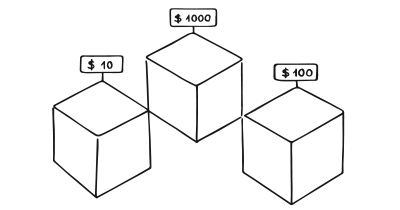
In pricing strategies, like those seen with SaaS platforms, a mid-tier pricing plan can be isolated and then anchored with a higher-priced plan to make it seem more valuable.

Items that stand out from their peers are more memorable

We tend to rely too heavily on the first information presented
Isolation Effect + Rewards
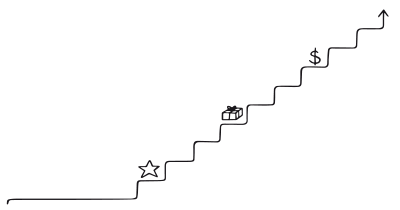
Loyalty programs often highlight a particular reward or status level, isolating it from others. This encourages users to reach that specific level to gain the reward, as seen in frequent flyer programs.

Items that stand out from their peers are more memorable

Use rewards to encourage continuation of wanted behavior
Isolation Effect + Temptation Bundling
Streaming services like Netflix often highlight a popular show or movie along with a less popular one, encouraging users to consume both, thereby employing the Isolation Effect in combination with Temptation Bundling.

Items that stand out from their peers are more memorable

Engaging in hard tasks is more likely when coupled with something tempting
Isolation Effect + Picture Superiority Effect
Infographics or educational platforms might isolate a crucial piece of information and accompany it with a memorable image, making the information easier to remember.

Items that stand out from their peers are more memorable

We remember images much better than words
Isolation Effect + Choice Closure
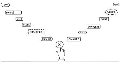
E-commerce platforms like Etsy often isolate and highlight customer reviews for a specific, purchased product to encourage the closure of choice, reinforcing the buyer’s decision.

Items that stand out from their peers are more memorable

We are more satisfied with decisions when we engage in physical acts of closure
Isolation Effect + Scarcity Bias
Retailers like eBay often isolate time-sensitive offers or items with low stock levels. This enhances the urgency created by scarcity, making the isolated element more compelling.�a�aThe effectiveness of combining the Isolation Effect with other patterns often depends on the context in which it is used. Always consider the user journey and the various touch points where these combinations can be most impactful.

Items that stand out from their peers are more memorable

We value something more when it is in short supply
A brainstorming tool packed with tactics from psychology that will help you build lasting habits, facilitate behavioral commitment, build lasting habits, and understand the human mind. It is presented in a manner easily referenced and used as a brainstorming tool.
Get your deck!- The effects of field formation in the trace field by Von Restorff
- The subtlety of distinctiveness: What von Restorff really did by Hunt
- Von Restorff, H. (1933). Über die Wirkung von Bereichsbildungen im Spurenfeld. Psychologische Forschung, 18, 299-342.
- McArthur, L. Z., & Post, D. L. (1977). Figural emphasis and person perception. Journal of Experimental Social Psychology, 13(6), 520-535.
- Kahneman, D., & Tversky, A. (1979). Prospect theory: An analysis of decision under risk. Econometrica, 47(2), 263-291.
- Tulving, E., & Pearlstone, Z. (1966). Availability versus accessibility of information in memory for words. Journal of Verbal Learning and Verbal Behavior, 5(4), 381-391.
- Duncker, K. (1945). On problem-solving. Psychological Monographs, 58(5), i-113.
- Hunt, R. R. (1995). The subtlety of distinctiveness: What von Restorff really did. Psychonomic Bulletin & Review, 2(1), 105-112.
- Goldstein, E. B., & Chance, J. E. (1985). Effects of training on Japanese character recognition: Test of an assimilation hypothesis. Perception & Psychophysics, 37(3), 177-185.
- Dunlosky, J., Hunt, R., & Clark, E. (2000). Is perceptual salience needed in explanations of the isolation effect? Journal of experimental psychology. Learning, memory, and cognition, 26(3), 649-57.
- Santos, I., & Young, A. (2005). Exploring the perception of social characteristics in faces using the isolation effect. Visual Cognition, 12, 213 - 247.
