Persuasive Patterns: Influence
Anchoring Bias
We tend to rely too heavily on the first information presented
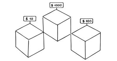
Anchoring Bias is the cognitive bias where an individual’s decisions are influenced by an initial piece of information, known as the “anchor,” which serves as a reference point for subsequent judgments.
Imagine you’re at a grocery store, standing in the cereal aisle. You notice that one brand of cereal is marked at $5, while another similar brand is priced at $4. The $5 price tag serves as an anchor, making the $4 cereal seem like a better deal, even if you have no prior knowledge about the actual value of either cereal. You’re more likely to purchase the $4 cereal, believing you’re making a more economical choice. This is the anchoring bias at work, subtly influencing your decision-making process based on an initial piece of information, the anchor.
Now, let’s transition to a digital context. Imagine you’re shopping online for a new laptop. The website you’re on displays a high-end laptop priced at $2,000 as the first option. As you scroll down, you see other options priced at $1,200 and $1,000. The initial $2,000 price serves as an anchor, making the other options appear more affordable and perhaps influencing you to spend more than you initially planned. This is a digital application of the anchoring bias, guiding your perception of value and potentially affecting your final choice.
In a study by Dogerlioglu-Demir & Koçaş (2015), it was found that for products with strong internal reference prices, anchoring occurs if the numerical value is part of the product identity and resembles a price. This is similar to the digital product scenario where the first high-priced laptop serves as an anchor, affecting your perception of the other options.
The study
One of the most discussed studies that introduced the concept of Anchoring Bias was conducted by psychologists Amos Tversky and Daniel Kahneman in 1974. In the study, participants were asked to estimate various quantities, such as the percentage of African nations in the United Nations. Before making their estimates, participants spun a wheel of fortune to generate a random number, which served as their “anchor.” The study found that participants’ estimates were significantly influenced by the random anchor, even though it had no relevance to the question being asked.
Tversky, A., & Kahneman, D. (1974). Judgment under Uncertainty: Heuristics and Biases. Science, 185(4157), 1124–1131.
The main psychological principle behind Anchoring Bias is heuristics, which are mental shortcuts that people use to simplify decision-making. Anchoring serves as one such shortcut by providing a reference point for subsequent judgments.
The pattern capitalizes on the human tendency to rely heavily on the first piece of information they encounter when making decisions. This initial information acts as an “anchor” that influences subsequent judgments and evaluations. For example, the first price offered for a product often serves as an anchor, affecting how reasonable or expensive subsequent prices appear. The pattern is commonly used in pricing strategies, negotiations, and comparative evaluations. Its primary goal is to guide user perception and decision-making in a manner that aligns with the objectives of the product or service.
Designing products with the Anchoring Bias
Anchoring Bias is a psychological principle that suggests people tend to rely on the first piece of information they encounter as a reference point for subsequent judgments and decisions. In product design, this cognitive bias can be leveraged to guide users toward particular choices and behaviors. However, the ethical implications and the user’s needs should always be at the forefront when applying this principle.
Anchoring is not just about setting a reference point; it’s also about understanding how that reference influences decisions. For instance, in e-commerce platforms, displaying the manufacturer’s suggested retail price alongside your sale price helps users perceive the value of the deal they are getting. The first price they see acts as an anchor, affecting their judgment about the sale price. Given that people often have difficulty remembering the prices of items they frequently purchase, this anchoring provides a valuable context.
When designing software user interfaces, the default settings can act as anchors. For instance, if a specific setting is generally recommended for most users, making it the default can improve user experience. However, it’s critical to ensure that these default settings do not limit the user’s ability to explore other options. The key is to use anchoring to guide but not to restrict, and to always allow the user to make their own choices freely.
Anchoring can also be effectively applied in form design. For example, when a user is required to create a password, showing a sample of a strong password can act as an anchor. This encourages the user to create a stronger password for themselves, thereby enhancing security. Importantly, transparency should be maintained about what constitutes a strong password, so as not to mislead users into thinking any password resembling the sample is automatically strong.
Visuals and diagrams can help users understand the anchoring points in an interface. Utilizing subtle color contrasts or icons next to anchor points like prices or options can provide clarity. This not only improves the user experience but also highlights a commitment to ethical design practices.
Anchoring is often used to set the stage for negotiations. By presenting an initial anchor price or offer, you can influence subsequent counteroffers and negotiations. However, it’s crucial that this anchor falls within an acceptable and plausible range. Setting an anchor that is too high or too low could backfire by making users skeptical or disengaged.
The effectiveness of anchoring can depend on the user’s familiarity with the product or concept in question. Generally, anchoring has a more potent impact when users are dealing with new or unfamiliar concepts. On the other hand, its influence tends to wane when dealing with individuals who have a high cognitive ability or prior experience with the product.
Types of Anchoring
According to William Hunt, there are two main types of anchoring: contrast anchoring and assimilation anchoring.
- Contrast anchoring
In contrast anchoring, the anchor serves as a reference point that makes other stimuli appear different, often in the opposite direction. For example, if you stare into the headlights of a car, the surroundings appear darker than they actually are. The bright light serves as an anchor, and your perception of its surroundings is altered in contrast to this anchor. In a more abstract sense, if a luxury store displays an extremely high-priced item, other items in the store may seem reasonably priced in comparison, even if they are also expensive. In contrast anchoring, subjective perceptions are skewed away from the anchor, often leading to judgments or decisions that are in the opposite direction of the anchor itself. - Assimilation anchoring
In assimilation anchoring, the anchor draws judgments or decisions toward itself. This type of anchoring is commonly used in marketing and pricing strategies. For example, if a store shows the “before” price of a discounted product, that original price serves as an anchor that influences the perceived value of the discounted price. Customers are more likely to see the discounted price as a good deal because their perception is drawn toward the anchor, the “before” price. In assimilation anchoring, subjective perceptions, judgments, or decisions are pulled toward the anchor, reinforcing or strengthening the anchor’s impact.
Both types of anchoring can be effective in different contexts, but their opposite effects make it crucial for designers and marketers to understand which type is more appropriate for a given situation. Ethical considerations should also be taken into account to ensure that the use of anchors does not mislead or manipulate users.
While traditionally seen as a cognitive limitation, anchoring bias can be intentionally used by designers to guide users toward favorable outcomes. This technique finds particular utility in onboarding processes and establishing brand perception. For example, a well-crafted initial onboarding experience can anchor users to a specific user journey or behavior. This is especially true when the defaults are well-chosen numerical values that minimize the cost of interaction, such as in the case of mortgage calculators or donation forms.
For users new to a particular platform or concept, anchoring can set them up for success by establishing clear expectations. For instance, showing default values in a mortgage calculator that represent the general user population can help new users gauge what’s expected and what’s not.
Always start by identifying what will serve as the anchor in your user experience. Whether it’s a price, a default setting, or a social metric, make sure it aligns with your objectives and serves the user’s needs.
While anchoring can guide user behavior, it’s crucial to allow room for user autonomy. This is particularly important when pairing anchoring with patterns like commitment and consistency, where the aim is to encourage user engagement over time.
Consider the experience level of your audience with your product or similar products. Anchoring tends to be less effective on more experienced users, so adjust your strategy accordingly.
Ethical recommendations
Ethically, the use of Anchoring Bias comes with responsibilities. Be transparent about why certain anchors are being presented; for instance, clarify why a particular product is labeled as “most popular” or why a default setting is recommended. The goal should always be to assist the user in making an informed decision rather than to push them toward a decision that primarily serves the interests of the business.
One of the most evident risks is the use of misleading comparisons. For instance, consider an e-commerce platform where the “original price” is displayed next to the “sale price” to highlight the discount offered. If the original price is inflated to make the sale appear more attractive, the user is misled into making a purchase based on false premises.
Another area of concern is the restriction of user choice through the use of default settings. In software applications, the settings recommended for “most users” often become the default. While this might appear to be user-friendly, it can inadvertently lead users to overlook options that may be more suited to their specific needs.
Anchoring also has the power to manipulate outcomes in negotiations, particularly when there is an imbalance of power or information between the parties involved. For example, in salary negotiations, an employer’s initial offer can serve as an anchor, potentially suppressing the employee’s counteroffers.
Moreover, the ethical dimensions of anchoring reach a critical level in sensitive contexts such as healthcare and financial services. In these scenarios, steering users towards particular choices can have long-lasting and significant impacts on their well-being.
To design with the Anchoring Bias in mind ethically, consider:
- How you are being transparent
Always be clear and transparent about the information that is being presented as an anchor. If you are showing a discounted price, make sure that the original price presented is accurate. - Respect user autonomy
While anchoring can guide behavior, it should not restrict the freedom of the user to make different choices. Always offer alternatives and make it easy for users to change default settings. - Informed consent
Especially in sensitive areas like healthcare, users should be fully informed about the options available to them and the consequences of their choices. Anchors should not be used to subtly manipulate choices in these contexts.
Real life Anchoring Bias examples
Oxfam
Uses suggested monthly donation values, leading to a 23% increase in form completions.
The premium plans are presented with features and pricing clearly compared, using the lower-tier options as anchors to make the higher-tier options seem more valuable.
Amazon
The e-commerce giant often uses anchoring by displaying the list price along with the discounted price, making the discount appear more attractive.
Trigger Questions
- Are we using anchors that fall within an acceptable and plausible range?
- How transparent are we about the use of anchors in our design?
- Are the anchors enhancing or complicating the user experience?
- What impact are the anchors likely to have on novice users versus experienced users?
- Are we using visual elements effectively to emphasize anchors?
- Have we considered the ethical implications of our chosen anchors?
Pairings
Anchoring Bias + Social Proof
Combining anchoring with social proof can be potent in e-commerce settings. For example, displaying the manufacturer’s suggested retail price next to your own price (anchoring) along with the number of people who have bought the item at the discounted price (social proof) can bolster the perception of value. Amazon often employs this technique.

We tend to rely too heavily on the first information presented

We assume the actions of others in new or unfamiliar situations
Anchoring Bias +
Scarcity Effect
By setting an initial high price (anchor) and indicating limited availability (scarcity), customers may perceive a product as more valuable. This combination is commonly used in flash sales and limited-time offers.

We tend to rely too heavily on the first information presented
Anchoring Bias +
Commitment and Consistency
Once users commit to an initial choice (e.g., subscribing to a basic plan), they are more likely to stick to options that are presented as similar or slightly better. LinkedIn’s tiered membership plans use this to great effect by anchoring users with a basic plan and then offering incremental upgrades.

We tend to rely too heavily on the first information presented
Anchoring Bias + Loss Aversion
Retailers frequently use the strategy of displaying the original price slashed next to the sale price. This creates an anchor and evokes a fear of missing out on the “savings,” capitalizing on the user’s natural tendency toward loss aversion.�a�aIntroduce the anchor first before presenting other elements like social proof or scarcity cues. The anchor sets the stage for the subsequent patterns to work more effectively.

We tend to rely too heavily on the first information presented
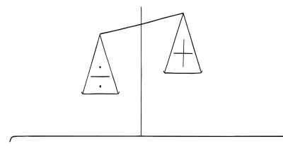
Our fear of losing motivates us more than the prospect of gaining
A brainstorming tool packed with tactics from psychology that will help you increase conversions and drive decisions. presented in a manner easily referenced and used as a brainstorming tool.
Get your deck!- Judgment under uncertainty: Heuristics and biases by Tversky & Kahneman
- Assimilation and contrast effects of anchoring stimuli on judgments by Sherif, Taub & Hovland
- Anchoring Bias
- Anchoring effect at Wikipedia (en)
- How Does Anchoring Influence Our Daily Decisions? at The Decision Lab
- Tversky, A., & Kahneman, D. (1974). Judgment under Uncertainty: Heuristics and Biases. Science, 185(4157), 1124–1131.
- Adaval, R., & Wyer, R. (2011). Conscious and Nonconscious Comparisons with Price Anchors: Effects on Willingness to Pay for Related and Unrelated Products. Journal of Marketing Research, 48, 355 - 365.
- Thaler, R., & Sunstein, C. R. (2008). Nudge: Improving decisions about health, wealth, and happiness. Yale University Press.
- Mussweiler, T., & Strack, F. (2000). Numeric judgments under uncertainty: The role of knowledge in anchoring. Journal of Experimental Social Psychology, 36(5), 495–518.
- Furnham, A., & Boo, H. C. (2011). A literature review of the anchoring effect. The Journal of Socio-Economics, 40(1), 35–42.
- Simmons, J. P., LeBoeuf, R. A., & Nelson, L. D. (2010). The effect of accuracy motivation on anchoring and adjustment: Do people adjust from provided anchors?. Journal of Personality and Social Psychology, 99(6), 917–932.
- Ariely, D., Loewenstein, G., & Prelec, D. (2003). Coherent Arbitrariness: Stable Demand Curves Without Stable Preferences. The Quarterly Journal of Economics, 118(1), 73–106.
- Dogerlioglu-Demir, K., & Koçaş, C. (2015). Seemingly incidental anchoring: the effect of incidental environmental anchors on consumers’ willingness to pay. Marketing Letters, 26, 607-618
- William Poundstone, Hill and Wang (2010). Priceless: The Myth of Fair Value (and How to Take Advantage of it)
