Persuasive Patterns: Education
Conceptual Metaphor
We understand a new idea or concept by linking it to another

Conceptual Metaphor is a design pattern that employs metaphorical concepts to simplify complex ideas, helping users understand and interact with a product or service.
Imagine a graphic designer trying to explain the concept of a design project to a client. The project is complex, involving multiple layers of visual elements and user interactions. Instead of overwhelming the client with technical details, the designer uses the metaphor of a “building construction” to explain the design layers and their interrelations. Just like the floors in a building, each layer serves a specific purpose and builds upon the one below it. This metaphor simplifies the complex design process, making it easier for the client to understand. According to a study by C. Burgers et al. (2015), using conventional metaphors can be persuasive by reducing complexity and increasing creativity and ad appreciation.
Consider Dribbble, a digital platform for designers to showcase their work. Dribbble uses the metaphor of “basketball” in its user interface and terminology. For example, designers don’t just upload projects; they “shoot” them. People who view and appreciate the designs are the “fans,” and the popular designs make it to the “playoffs.” This basketball metaphor simplifies the user experience, making the platform engaging and easy to navigate.
The study
One foundational study in the realm of Conceptual Metaphor was conducted by George Lakoff and Mark Johnson, who examined how metaphors are not just linguistic expressions but are integral to thought itself. Their work showed that metaphorical thinking aids in understanding complex systems, an insight directly applicable to design. For instance, they discussed the metaphor of a “desktop”. The computer desktop with its “files” and “folders” was an abstraction of an actual physical desktop. This metaphor eased the learning curve for users who were new to digital technology by providing a familiar conceptual framework. The authors extended the argument to suggest that our conceptual metaphors also extend to abstract thought and even to self-perception. For example, our understanding of arguments is metaphorically structured as war; we attack points, defend positions, and so on. This impacts how we engage in argumentation and influences our expectations for what an argument is.
Lakoff, G., & Johnson, M. (1980). Metaphors We Live By. University of Chicago Press.
The main psychological principle underlying the persuasive pattern of “Conceptual Metaphor” is cognitive structuring. Cognitive structuring refers to the way our minds organize complex information into comprehensible frameworks. Metaphors act as a cognitive tool that help individuals understand abstract or unfamiliar concepts by linking them to known experiences. By using metaphors, designers can facilitate understanding, guide perception, and influence behavior in intended ways.
The primary goal of using Conceptual Metaphor in design is to facilitate user comprehension and engagement. By likening a product’s features or actions to something more familiar, designers can reduce cognitive load and make the interface more intuitive. Just like we would use heuristic shortcuts provided by cognitive biases, a conceptual metaphor provides a shortcut to letting the user comprehend by comparing an unfamiliar concept to a familiar one. This approach is particularly useful for products that are complex or novel, where standard design paradigms might not be sufficient for user understanding.
Designing products with a Conceptual Metaphor
The use of conceptual metaphor in product design can greatly enhance user experience by providing intuitive pathways for interaction. Conceptual metaphor relies on transposing well-understood experiences or ideas onto new or abstract concepts. For example, think about the “desktop” metaphor in computing, which uses the familiar concept of a physical desk to help users understand the abstract digital space.
When applying conceptual metaphor in product design, focus on widely understood experiences that can help users easily navigate your product. Choose metaphors that align with the product’s core functionality. Additionally, the chosen metaphor should be culturally appropriate, as certain metaphors may have different meanings or relevance in various cultural contexts.
Another key consideration is ethical application. Make sure that the metaphor does not oversimplify or misrepresent complex processes or systems, leading to potential misunderstanding or misuse. For example, a metaphor that makes a complex financial decision appear overly simple might mislead users, raising ethical concerns.
We apply conceptual metaphors in product design to make complex or unfamiliar elements relatable to the user by borrowing from their existing knowledge. To this end, there are several strategies:
- Explain difficult concepts by making analogies
For example, if you’re working on a new type of project management software, employing the metaphor of a “sports game” can immediately suggest notions of teamwork, strategy, and, importantly, fun. In this scenario, each project could be viewed as a “game,” tasks as “plays,” and team members as “players.” Goals or milestones could be referred to as “touchdowns” or “home runs,” bringing an element of excitement and engagement to the otherwise mundane project planning process. - Draw favorable analogies
It’s essential to be mindful of the perceptions that certain metaphors can evoke. Choose metaphors that paint your product in a favorable light. For example, if you are creating a cybersecurity application, a favorable analogy might be a “fortress” or “vault,” implying strong, unbreachable security features. - Make the unfamiliar familiar
Users are more likely to engage with your interface if they feel at home. A classic example here would be Apple’s early desktop design, which used a trash can to signify deletion and file folders for organizing—both metaphors borrowed from an actual office setting. It immediately made users understand the function of those elements, easing them into the unfamiliar territory of a computer interface. - Make the abstract concrete
When dealing with abstract concepts, make them tangible by drawing on visual, functional, or structural similarities. Consider an app that helps people invest in the stock market. The abstract idea of ‘investing’ could be made more concrete through metaphors like “planting a seed and watching it grow” to represent long-term investments or “surfing” for short-term investments, showing the risks and thrills involved. - Make the obvious emotional
Transferring emotional undertones from familiar concepts to your product can generate a more profound connection with your users. For instance, if you’re creating a fitness application, using the metaphor of a “personal fitness journey” might make the experience more emotional and rewarding.
It’s crucial to remember that the metaphor chosen should be extendable across the various functionalities of your product. That is, it shouldn’t just be a one-off; the metaphor should be capable of influencing the entire user experience, creating a cohesive feel across different screens or functionalities.
Practically applying conceptual metaphors involves taking a step back to think creatively, almost in a playful manner. This mental state, akin to sketching or brainstorming, allows designers to see connections between seemingly unrelated elements.
To effectively search for appropriate metaphors, keep these tips in mind:
- Embrace a wide-angle view
Starting from the premise that creative breakthroughs can occur when ideas are transplanted from one domain to another, consider a wide range of domains for metaphorical inspiration. - Develop a sketching mindset
Think of metaphor generation like sketching: you don’t have to get it right on the first try. Encourage yourself and your team to generate a large number of metaphorical associations without self-criticism. In this stage, embrace the principle of “quantity over quality.” - Game-like ideation
Utilize playful and provocative methods to stimulate ideas. This could include asking your team questions like, “If this feature were a car, what kind of car would it be?” Push these associations further, looking for a metaphor that is extensible across multiple facets of your design problem. - Bring in an instigator
Choose a team member who is good at widening the field of association to provoke ideation. Listen carefully for phrases like “it’s like” or “it’s almost like” and use these moments to deepen the metaphorical association by asking further questions: “What kind of relationship is this? What animal would they be?” - Take a metaphorical walk
Encourage the team to imagine different environments and their metaphorical associations. From desert scenes to spaceships, this approach helps you to question assumptions and find fresh perspectives. - Explore extremes
If your data analysis reveals, for instance, that users have a strong competitive motivation, extend that notion to its metaphorical extreme—maybe to the concept of “victory” or “triumph.” These extreme concepts often provide deeper insights and are more engaging. - Evaluate using a party invitation
If your product was a party, who would be invited, what would the dress code be, and would there be food? This metaphorical framework can help evaluate your initial design choices and direct future iterations. - Correlate with behavioral data
Use the metaphors to dig deeper into the behavioral data you’ve gathered. By linking metaphorical elements to real-world behaviors, you can further validate your metaphor and offer specific, actionable recommendations for design.
Be careful to not fall into these common pitfalls
- Misalignment of metaphor and functionality
Ensure that the metaphor aligns well with what the product is supposed to do. A poorly chosen metaphor can create confusion. - Overcomplication
Using multiple conflicting metaphors can muddle the user experience. Stick to one clear metaphor. - Cultural insensitivity
Some metaphors may not translate well across different cultures, potentially causing misunderstanding or offense.
Ethical recommendations
While conceptual metaphors can make complex topics more accessible, their misuse has ethical implications that must be carefully considered.
Ethical considerations are another aspect that should be weaved into these design choices. Always ensure that the metaphor is inclusive and doesn’t carry cultural or social biases. For instance, a “fortress” metaphor in a cybersecurity application might signify strength and safety to some but could also inadvertently evoke isolation or exclusivity to others.
The most pressing ethical issue is the potential to manipulate how users perceive a product, service, or situation. For example, a financial service that employs the metaphor of a “safe harbor” might lead users to believe that the investment is devoid of risks. This could encourage individuals to invest more than they might otherwise, exposing them to financial loss. Therefore, it becomes a question of how much influence a metaphor should have over user decisions, and whether that influence is ethical if it distorts reality.
Conceptual metaphors can simplify intricate subjects, which generally aids in understanding. However, there’s a line between simplification for clarity and oversimplification that misleads. When key elements of a topic are omitted, the metaphor can create a false sense of understanding. For instance, if a health app describes calorie counting as “fueling your body’s engine,” it might omit the complexities of nutrition and metabolism, leading a user to make decisions that don’t actually support their health goals.
Metaphors often carry cultural significance and may not translate well across different cultures or communities. Using a metaphor that is rooted in a specific cultural context can create confusion or even offense if applied globally. For instance, a metaphor that equates a rigorous process to a “rite of passage” could be problematic for individuals from cultures where rites of passage have specific and deeply meaningful implications.
Real life Conceptual Metaphor examples
Shopping carts
E-commerce websites use a shopping cart metaphor to help users understand the purchasing process.
Cloud storage
Services like Google Drive and Dropbox use the cloud metaphor to convey the idea of storage space that is abstract and limitless.
Social media feeds
Platforms like Facebook and Twitter use the concept of a ‘feed’ as a metaphor for their content streams, simulating the experience of a news feed ticker.
Trigger Questions
- What real-world actions can we metaphorically translate to our product?
- What familiar experiences can we link to unfamiliar functionalities?
- Are the metaphors chosen culturally and ethically appropriate?
- How can we make abstract concepts more concrete through metaphor?
- Does the metaphor maintain consistency throughout the product?
- What emotional undertones do we wish to convey through our metaphor?
- How can we ensure our chosen metaphor is culturally sensitive?
- Does our metaphor align with the primary functionality of our product?
Pairings
Conceptual Metaphor + Storytelling
: Brands often use storytelling to flesh out a conceptual metaphor. For instance, a coffee brand might use the metaphor of a “morning ritual” and tell stories of people’s unique morning coffee routines. This merges the metaphor with real-life narratives, making it relatable and enticing for the consumer to become a part of this story themselves.

We understand a new idea or concept by linking it to another

We engage, understand, and remember narratives better than facts alone
Conceptual Metaphor +
Framing
+ Loss AversionInsurance companies often utilize the metaphor of a “safety net” to describe their services. Coupled with the framing technique that emphasizes the risks of not having insurance, the metaphor becomes even more potent. Users are led to consider their choices not just as purchasing a service, but as acquiring a safety mechanism, making the decision more compelling.

We understand a new idea or concept by linking it to another
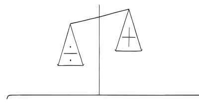
Our fear of losing motivates us more than the prospect of gaining
Conceptual Metaphor + Loss Aversion + Anchoring Bias
In ecommerce, the metaphor of “cart” is often used. Coupled with a strikethrough price next to a discounted price, the cart metaphor enhances the loss aversion. People feel they are putting valuable items in their cart while avoiding the loss of missing out on a deal, anchored by the original higher price.

We understand a new idea or concept by linking it to another

Our fear of losing motivates us more than the prospect of gaining
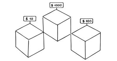
We tend to rely too heavily on the first information presented
Conceptual Metaphor + Social Proof
Websites like Amazon frequently combine user reviews (Social Proof) with metaphors related to a “Marketplace” to enhance the credibility and user-friendly nature of their platforms.

We understand a new idea or concept by linking it to another

We assume the actions of others in new or unfamiliar situations
Conceptual Metaphor + Rewards
In gamified language learning apps like Duolingo, the metaphor of a “learning journey” is used. As users complete lessons or reach milestones, they’re rewarded with points or badges. Here, the metaphor reinforces the idea of progression, while the reward system offers immediate gratification, further encouraging consistent engagement with the app.

We understand a new idea or concept by linking it to another

Use rewards to encourage continuation of wanted behavior
Conceptual Metaphor + Chunking
Instructional websites or educational platforms can use the metaphor of “building blocks of knowledge.” They might then break down complex subjects into smaller, more manageable “blocks” or modules. This meshes well with the psychological principle of chunking, making it easier for users to absorb and retain information.

We understand a new idea or concept by linking it to another
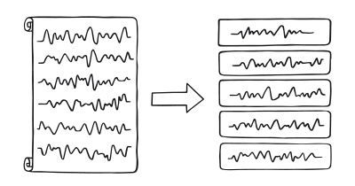
We process and remember information grouped into manageable bits more easily
Conceptual Metaphor +
Framing
In the context of charitable donations, the metaphor of “giving a hand” can be paired with positive framing (“help lift someone out of poverty”) to increase the likelihood of contributions.

We understand a new idea or concept by linking it to another
Conceptual Metaphor + Role Playing
Fitness platforms may employ the metaphor of “being the hero in your own story,” inviting users to adopt this role seriously. The app may offer avatars or other personalization features that allow the user to customize their “heroic persona.” This blends the compelling narrative of the metaphor with the persuasive pattern of role-playing, enhancing engagement and motivation.�a�aWhen combining patterns, identify their shared goals. For example, if both the Conceptual Metaphor and Rewards aim to increase user engagement, they can likely be effectively integrated.

We understand a new idea or concept by linking it to another

People act according to their persona
A brainstorming tool packed with tactics from psychology that will help you build lasting habits, facilitate behavioral commitment, build lasting habits, and understand the human mind. It is presented in a manner easily referenced and used as a brainstorming tool.
Get your deck!- Metaphors We Live By by Lakoff & Johnson
- Seeing the voice of the customer: Metaphor-based advertising research by Zaltman & Coulter
- SurveyMonkey for Customer Experience Teams at SurveyMonkey
- Lakoff, G., & Johnson, M. (1980). Metaphors we live by. University of Chicago Press.
- Lakoff, G., & Turner, M. (1989). More than cool reasons. University of Chicago Press.
- Deignan, A. (2005). Metaphor and corpus linguistics. John Benjamins.
- Kövecses, Z. (2010). Metaphor: A practical introduction (2nd ed.). Oxford University Press.
- Burgers, C., Konijn, E., Steen, G., & Marlies A. R. Iepsma. (2015). Making ads less complex, yet more creative and persuasive: the effects of conventional metaphors and irony in print advertising. International Journal of Advertising, 34, 515-532.
- Myers, J., & Jung, J. (2019). The interplay between consumer self-view, cognitive style, and creative visual metaphors in print advertising. Journal of Marketing Communications, 25, 229-246.
- Charteris-Black, J. (2011). Politicians and Rhetoric: The Persuasive Power of Metaphor. Palgrave Macmillan.
- Thibodeau, P. H., & Boroditsky, L. (2011). Metaphors We Think With: The Role of Metaphor in Reasoning. PLoS ONE 6(2).
- Gibbs, R. W. (1994). The Poetics of Mind: Figurative Thought, Language, and Understanding. Cambridge University Press.
- Gentner, D., & Markman, A. B. (1997). Structure mapping in analogy and similarity. American Psychologist, 52(1), 45-56.
- Ortony, A. (1993). Metaphor and Thought. Cambridge University Press.
- Black, M. (1979). More about Metaphor. D. Reidel.
