Salience refers to how our decisions are influenced by the prominence and visibility of the information presented to us. When data is made salient – that is, easily noticeable or striking – it can shape how we evaluate choices, make decisions, and prioritize actions.
You find yourself in a busy grocery store, overwhelmed by the sheer number of options lining the shelves. Your attention is drawn to a brightly colored display at the end of the aisle. This prominent placement, utilizing the Salience pattern, makes the featured product stand out from the visual clutter, piquing your curiosity and potentially influencing your purchase decision (Heath & Chatterjee, 2003).
The same is true for digital products. Consider a news website. Headlines in bold type or breaking news alerts displayed prominently at the top of the homepage utilize salience to ensure users don’t miss important stories (Huang et al., 2017). By strategically highlighting specific content, designers nudge users towards the information deemed most important.
Salience acts as a filter, directing our focus to specific elements within a crowded environment. This persuasive pattern plays a significant role in shaping our decisions, both in the physical world and within the digital experiences we encounter daily.
The study
A seminal study on the concept of Salience was conducted by Kahneman and Tversky (1984), which explored how people make decisions based on how information is framed and presented. This study, along with others, demonstrated the power of Salience in shaping behavior and decisions.
In one experiment, participants were presented with two medical treatment options for a group of patients: one treatment framed as saving 200 lives and another framed as resulting in 400 deaths out of 600 patients. Despite both options being statistically equivalent, the framing influenced the participants’ decisions. The positive framing of “saving lives” led to a higher selection rate for the first option, illustrating how salient information shapes decision-making.
The study’s findings reveal that how information is presented significantly impacts individuals’ choices, emphasizing the importance of Salience in design and communication strategies. This insight has broad applications in areas such as marketing, healthcare, and education, where framing information in a salient manner can drive behavior.
Kahneman, D., & Tversky, A. (1984). Choices, values, and frames. American Psychologist, 39(4), 341-350.
The Salience pattern leverages the psychological principle that information made prominent or vivid can guide our behavior. When designing products or services, making key data or features stand out can help steer users towards desired actions. For example, a healthcare app might highlight daily steps or calories burned on its homepage, encouraging users to engage more with fitness-related activities. Similarly, an e-commerce website might emphasize limited-time offers or discounts, prompting users to make purchases.
Salience is particularly effective because it taps into our natural tendency to focus on and act upon information that is immediately noticeable or emotionally engaging. This pattern can be harnessed in various ways, such as through visual design elements, strategic content placement, or by making critical information available at key moments in a user’s journey.
Customers often miss what they don’t notice, as the quote highlights: “Nobody counts the number of ads you run; they just remember the impression you make.” This resonates with the core principle of Salience: our decisions are heavily influenced by the prominence of information. When information is presented more noticeably, it captures our attention and has a greater impact on our choices.
Psychologically, Salience is rooted in Selective Attention. Our brains are bombarded with sensory data, and selective attention acts as a filter, prioritizing the most relevant stimuli. Several factors contribute to what we perceive as salient:
- Attentional biases
We naturally gravitate towards certain information, influenced by factors like novelty, repetition, and emotional relevance. A surprising ad or a heartwarming image will likely grab our attention due to its novelty or emotional pull. - Cognitive heuristics
Mental shortcuts like the availability heuristic play a role. We tend to rely on information readily available in memory, often equating salience with importance. For instance, a brand with prominent advertising might be perceived as more established or trustworthy. - Social influence
Social comparison and conformity can enhance salience. If others seem interested in something, it becomes more noticeable to us. Think of a popular product suddenly appearing on everyone’s social media feed.
These factors align with theoretical concepts like:
- Selective attention
We focus on the most noticeable stimuli, potentially overemphasizing salient information in decisions. - Priming
Exposure to related stimuli activates certain mental representations, making salient information more readily accessible and influential. - Framing Effect
Presenting information in a specific way emphasizes certain aspects, influencing the perceived importance (salience) of different options.
Salience is about creating cognitive ease, simplifying information processing. Elements like luminance (brightness), texture, contrast, and scale all contribute to making information visually distinct and salient.
Designing products with Salience
To effectively leverage salience in design, designers can employ various strategies aimed at making key product features more prominent and noticeable to users.
One such strategy is highlighting essential features through visual cues like contrasting colors, larger fonts, or prominent placement on the interface. By emphasizing these features, designers increase the likelihood that users will take notice and consider them when making decisions.
Pairing with Social Proof by incorporating testimonials, reviews, or endorsements from satisfied customers can make the product more credible and noticeable to potential buyers. Additionally, displaying the number of users or customers who have engaged with the product can create a sense of popularity and urgency, further increasing its salience.
Framing options and choices in a way that emphasizes certain attributes can also influence users’ perceptions and preferences. Presenting a product as the “most popular choice” or the “best value for money” can make it more salient compared to other options. Similarly, structuring pricing plans or subscription tiers to highlight the most advantageous features can guide users towards their preferred choice.
Incorporating visual elements such as images, icons, or infographics can enhance the salience of information related to the product. Visual representations not only attract attention but also aid in conveying complex information in a clear and memorable way. Utilizing visual hierarchy and layout techniques further prioritizes and emphasizes important details, guiding users’ attention towards key selling points.
From a design perspective, Salience plays a crucial role in driving what users pay attention to, ultimately influencing their decisions and actions. Designers must proactively shape the user experience to guide users towards desired decision outcomes. This involves creating a clear and balanced interface where the most important information takes center stage. By thoughtfully applying these principles, designers can harness the power of salience to enhance user experience and guide them towards desired actions within the product.
Ethical recommendations
Salience, while a powerful persuasive pattern, carries the risk of being misused to the detriment of users. One potential misuse involves manipulating the presentation of data to prioritize certain information over others, leading users to make decisions that may not be in their best interest. For example, a financial services app might emphasize the benefits of a high-risk investment without adequately disclosing the associated risks, potentially leading users to make uninformed decisions.
Another ethical concern relates to the exploitation of users’ cognitive biases and vulnerabilities. Designers may intentionally leverage salience to capitalize on users’ cognitive limitations, such as their tendency to focus on prominent information or overlook less conspicuous details. This can result in users making decisions based on incomplete or biased information, undermining their autonomy and well-being.
Stay away from:
- Highlighting irrelevant or unimportant information can distract users from making informed decisions. Imagine a news website prioritizing sensationalized headlines (salient) over factual reporting, potentially misleading users.
- Overusing scarcity cues (limited-time offers) or emphasizing potential losses can create undue pressure and encourage impulsive decisions.
- Deliberately de-emphasizing crucial details like fees or subscription terms can mislead users.
To ensure that the salience pattern is used in an ethical and user-centric manner, several best practices should be followed:
- Be transparent
Clearly present all relevant information, allowing users to make informed choices. Don’t rely solely on Salience to overshadow important details. - Focus on value
Highlight features and benefits that genuinely improve the user experience. Avoid manipulative tactics that exploit user anxieties or biases. - Prioritize user trust
Building trust is essential for long-term user engagement. Use Salience ethically to guide users, not deceive them.
Real life Salience examples
Apple
Apple strategically frames its product options to emphasize certain attributes, such as the “Pro” or “Max” versions of their devices. This influences consumers’ perceptions and preferences, guiding them towards higher-priced options.
Starbucks
Starbucks structures its loyalty program to highlight the benefits of membership, such as earning stars for purchases and redeeming rewards. By making these benefits salient, they incentivize customers to participate and increase their engagement with the brand.
Netflix
Netflix employs the salience pattern by prominently displaying personalized content suggestions based on users’ viewing habits. This encourages users to explore new content and enhances their overall viewing experience.
Trigger Questions
- What are the key actions we want users to take?
- What information is most critical for users to make informed decisions?
- How can we visually differentiate between primary and secondary elements?
- Are we leveraging social proof (reviews, user counts) strategically?
- Can data visualization (icons, infographics) enhance user understanding?
Pairings
Salience + Social Proof
Highlight testimonials, reviews, or user counts with prominent placement and contrasting visuals. E-commerce giant Amazon prominently displays star ratings next to products, leveraging both Salience and Social Proof to influence purchase decisions.

Our decisions are shaped by the data presented to us

We assume the actions of others in new or unfamiliar situations
Salience + Authority Bias
Showcase endorsements from experts or trusted figures alongside salient product features. A financial services company might feature a video testimonial from a renowned economist, using Salience and Authority Bias to build user trust.

Our decisions are shaped by the data presented to us
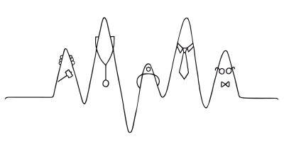
We have a strong tendency to comply with authority figures
Salience + Positive Mimicry
Pairing salient information with social cues or visual indicators of positive behavior can influence users’ perceptions and actions. Social media platforms often use this combination by highlighting friends’ interactions with content alongside salient features, encouraging users to mimic similar behaviors.

Our decisions are shaped by the data presented to us
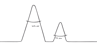
We learn by comparing our behavior with the actions of others
Salience + Loss Aversion
Emphasize the potential negative consequences of inaction. A fitness app might highlight the user’s progress towards a fitness goal alongside a salient reminder of the negative health effects of inactivity, leveraging Salience and Loss Aversion to motivate continued app usage.

Our decisions are shaped by the data presented to us
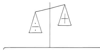
Our fear of losing motivates us more than the prospect of gaining
A brainstorming tool packed with tactics from psychology that will help you build lasting habits, facilitate behavioral commitment, build lasting habits, and understand the human mind. It is presented in a manner easily referenced and used as a brainstorming tool.
Get your deck!- Social cognition: From brains to culture by Fiske & Taylor
- Gorillas in our midst: Sustained inattentional blindness for dynamic events by Simons & Chabris
- Kahneman, D., & Tversky, A. (1984). Choices, values, and frames. American Psychologist, 39(4), 341-350.
- Johnson, E. J., & Goldstein, D. G. (2003). Do defaults save lives? The effect of biometric registration defaults on organ donation rates. Journal of Public Economics, 87(3-4), 147-174.
- Thaler, R. H., & Sunstein, C. R. (2008). Nudge: Improving decisions about health, wealth, and happiness. Yale University Press.
- Schmidt, S. R., & Williams, A. R. (2001). Memory for humorous cartoons. Memory & Cognition, 29(2), 305–311.
- Heath, C., & Chatterjee, S. (2003). Product placement in context: Persistence and localization effects. Journal of Marketing Research, 40(3), 317-333.
- Huang, H., Zhang, J., Zhao, X., & Li, J. (2017). Attention bias caused by news salience in online information processing. Behaviour & Information Technology, 36(12), 1582-1592.
- Jacoby, J., Speller, D. E., & Berning, C. K. (1974). Brand positioning: Store location and brand selection. Journal of Retailing, 50(1), 59-69.
- Inman, J. J., Zia, L. D., McFadden, S. E., Peck, J., & Chang, C. (1989). Selecting advertising formats: A study of viewer attention to alternative television commercial presentation modes. Journal of Marketing Research, 26(3), 386-393.
- Shapiro, A., Tauber, E., & Trajtenberg, M. (2002). Salience, complexity, and user interface design. International Journal of Human-Computer Studies, 56(4), 381-396.
