Persuasive Patterns: Demonstration, Facilitation
Recognition over Recall
We are better at recognizing things than we are recalling them from memory
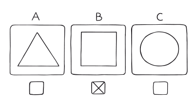
Recognition over Recall refers to the design principle where users are guided to recognize information or options rather than having to recall them from memory.
Imagine you are in a grocery store, walking down the aisles to pick up items for dinner. You have a mental list of ingredients you need but find it challenging to remember them all. Then you see a display of spices, and suddenly you recognize the paprika you had forgotten to add to your mental list. The sight of the spice jars triggers your memory, making it easier to recognize what you need rather than recalling it from scratch. This is an example of how recognition can be easier than recall in everyday situations. The phenomenon is supported by research that suggests recognition is enhanced by encoding which integrates the details within each item, while recall is enhanced by encoding which interrelates the items of a list.
Now, let’s consider a digital example. Imagine you are using a social media platform that asks you to list your interests. One version of the platform provides a blank text field, asking you to type in your interests. Another version shows a list of common interests, allowing you to select from it. You find it much easier to recognize and select your interests from the list than to recall and type them into a blank field. This digital design choice leverages the principle of “Recognition over Recall,” making the user experience more efficient and less cognitively demanding. The design aligns with research findings that suggest recognition is often easier and more reliable than recall.
The study
One study that has significantly contributed to our understanding of the “Recognition over Recall” pattern is Barbara Tversky’s 1973 research on encoding processes in recognition and recall. The study delves into the cognitive psychology behind how we remember and recognize information. Tversky’s research found that recognition is enhanced by encoding that integrates the details within each item, while recall is enhanced by encoding that interrelates the items on a list. In simpler terms, when details are closely tied together, it’s easier for us to recognize them, but when we need to remember a list of items, it helps if we can relate those items to each other.
Tversky, B. (1973). Encoding processes in recognition and recall. Cognitive Psychology, 5, 275-287.
In a digital environment, it’s often more efficient for a user to recognize information than to recall it. This pattern aims to minimize cognitive load by offering cues, hints, or choices, thereby making tasks easier and faster to complete. It is often implemented in search functions, form fill-ins, and navigational menus. Its primary goal is to enhance user experience by making interaction more intuitive and less mentally taxing.
The psychological principle underlying the pattern of “Recognition over Recall” is rooted in the availability heuristic. This heuristic suggests that individuals are more likely to rely on information that is readily accessible or “available” to them when making judgments and decisions. In cognitive psychology, the term “availability” describes the ease with which certain kinds of information can be retrieved from memory.
The availability heuristic operates on the premise that if something can be easily brought to mind, it must be important or occur frequently. In terms of recognition versus recall, recognition tasks are generally easier because they often provide cues that make the desired information more “available.” For example, multiple-choice questions offer a range of answers that you can recognize, while fill-in-the-blank questions require you to recall information without any cues, making the task more challenging.
Recognition tasks reduce cognitive load, as they essentially “cue” the user by presenting options. This cueing process assists in making information more readily available, conforming to the availability heuristic. This is why interfaces with good design often use recognition rather than recall, such as offering icons along with text in a menu or using commonly understood symbols like a trash can for “delete.”
The pattern of “Recognition over Recall” has its roots in both psychological research and the practical field of user experience (UX) design. Notably, it appears as one of the key heuristics in Jakob Nielsen’s widely referenced list of “10 Usability Heuristics for User Interface Design.” Developed in the 1990s, Nielsen’s list has had a substantial impact on how designers approach UX, and it remains influential to this day.
Designing products with Recognition over Recall
To effectively apply the Recognition Over Recall pattern in user interface design, it’s crucial to understand how memory works. Memory is organized in chunks, basic interconnected units, each with an activation level that signifies how easily that chunk can be retrieved. Activation is influenced by three factors: practice, recency, and context. The more you practice a piece of information, the higher its activation becomes. The same goes for recently used information and information that is in the current focus of attention.
Association is another key concept in memory. Chunks in memory are interconnected through associations. When one chunk is activated, it can spread activation to related chunks. Understanding this mechanism of spreading activation through associations is essential in designing for recognition. It forms the basis for learning and problem solving, enabling users to have a relevant conversation and discover new things.
The difference between recognition and recall lies in the number of cues available for memory retrieval. Recognition involves more cues and is therefore easier. A user interface designed for recognition presents options directly to the user, minimizing the need for memory recall. For example, a menu system allows the user to simply recognize the command they want, rather than having to recall it.
Recall is more effortful and prone to errors, which can frustrate users and lead them to abandon tasks. To minimize the need for recall:
- Use familiar icons and labels that users can quickly recognize. This requires less cognitive effort.
- Provide visual cues through color, contrast, and typography. These can guide users to important elements on the page.
- Stick to common patterns in design to meet user expectations, further reducing the need for recall. For instance, placing the website logo in the top-left corner is a standard users are familiar with.
- Group related information together. This simplifies navigation by allowing users to find what they’re looking for without having to remember its location.
As you apply the Recognition over Recall pattern, your goal is to minimize the user’s cognitive load, making tasks less daunting and more efficient for users.
Let’s examine specific design elements where recognition can have a significant impact:
- Navigation menus
Instead of text-heavy menus, consider using recognizable icons or labels accompanied by tooltips for easier navigation. This spares users the need to remember what each option does, enhancing usability. - Search fields
Autocomplete features can serve as another excellent example. By providing recognizable options based on initial text input, users can select from the options rather than recalling exact terms. - Forms and data entry
Field labels and sample text should be obvious enough to be recognized by users without needing to recall the purpose of the field. Input masks for phone numbers, credit cards, and other formatted data also enhance recognition. - Settings
Whether it’s an app or a device, grouping related options under recognizable symbols or headers enables users to find what they are looking for without having to search or rely on memory. - CTA Buttons
The language and appearance of Call-To-Action (CTA) buttons should be instantly recognizable for what action they will trigger. Avoid jargon or unfamiliar terms that could cause confusion. - Progress indicators
In a multi-step process, showing a progress indicator lets the user know where they are, aiding recognition of the task at hand. - Feedback mechanisms
Offering instant, recognizable feedback like a check mark or color change upon successful completion of a task can be extremely beneficial. It lets users know they’ve done something correctly without needing to recall the rules or guidelines.
Ethical recommendations
As with any persuasive design pattern, the application of Recognition over Recall carries ethical implications that need to be conscientiously addressed. While the pattern can significantly enhance user experience by minimizing cognitive load and simplifying decision-making, its misuse could potentially lead to detrimental outcomes for the user.
One of the cornerstones of Recognition over Recall is the system’s ability to present options or information that the user is likely to recognize, often based on past interactions. This requires collecting and analyzing user data, which could raise significant concerns about data privacy. If not properly managed, the data might be susceptible to unauthorized access or misuse.
While the primary aim of Recognition over Recall is to reduce the cognitive burden on users, its inappropriate application might actually have the opposite effect. Overemphasis on recognizable options may overload the user with frequent decisions, leading to decision fatigue. This not only contradicts the pattern’s objective but can also compromise the user’s satisfaction and engagement levels.
Recognition over Recall can be programmed to direct user attention towards options that primarily benefit the service provider rather than the user. For example, the pattern could be used to highlight more expensive items or additional features that generate more revenue but may not be necessary for the user.
By focusing only on presenting recognizable options based on the user’s past behavior or expressed preferences, Recognition over Recall can inadvertently create a loop that limits the user’s exposure to different ideas, perspectives, or choices. This could contribute to the creation of echo chambers, where the user is only exposed to information that reinforces their existing beliefs or preferences.
To apply the pattern both ethically and effectively, consider adhering to these recommendations:
- Transparent data usage
Given the potential for data privacy issues, it’s crucial to be transparent with users about what data is being collected and how it will be used. Service providers should offer easily accessible privacy settings where users can opt-in or opt-out of data collection related to Recognition over Recall. - User control
Providing users with control over the operation of Recognition over Recall pattern is another ethical practice. Users should have the option to reset or modify what the system deems as ‘recognizable’ to them, thereby giving them agency in shaping their own experience. - Ethical steering
When deploying Recognition over Recall to guide user decisions, care should be taken to ensure that the array of options presented are balanced and ethically sound. Regular audits could help in maintaining this balance, ensuring that the algorithm driving the pattern serves the user’s interest. - Diverse offerings
To counter the risk of creating echo chambers, it’s advisable to include a degree of diversity in the options presented to the user. This can be achieved by occasionally incorporating different yet relevant options that broaden the user’s horizon without overwhelming them.
Real life Recognition over Recall examples
Google Search
As you begin typing, a dropdown list appears, offering suggestions based on what you’ve typed so far. This saves the user from having to fully recall the exact term or phrase they are looking for.
Spotify
Spotify reduces cognitive load by showing a ‘Recently Played’ list, allowing users to easily go back to their favorite music without recalling specific album or song names.
TurboTax onboarding
In their onboarding questionnaire, the software asks simple questions and provides multiple-choice answers, making it easier for users to recognize the correct answer rather than recall specific tax rules or terms.
Trigger Questions
- Are we reducing the cognitive load for our users?
- Is the meaning of each recognizable element clear and unambiguous?
- Are we considering the cultural context of our recognizable symbols?
- Have we tested the recognizable elements for intuitiveness across diverse user groups?
- Do the recognizable elements speed up decision-making and task completion?
- Are we using recognition ethically to guide but not manipulate user choices?
Pairings
Recognition over Recall + Limited Choice
The Limited Choice pattern prevents cognitive overload by offering fewer, more curated options to the user. When coupled with Recognition over Recall, these limited options are also familiar or easily recognizable, making the decision process even more efficient. By showing you titles you’re likely to recognize, Netflix minimizes the time you spend on selecting what to watch, thus increasing your satisfaction and the likelihood of making a choice. �aImagine you are browsing an online bookstore that uses this pairing. Instead of showing you every available book, it offers a limited selection of titles on the homepage based on your past browsing or purchase history. This makes it easier for you to recognize a book you’ve been meaning to read, thus simplifying the decision process.

We are better at recognizing things than we are recalling them from memory
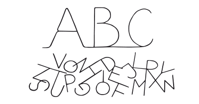
We are more likely to make a decision with fewer options to choose from
Recognition over Recall + Priming Effect
The Priming Effect prepares the user’s mind to receive certain kinds of information or to feel a certain way. When subsequent content is easily recognizable (Recognition over Recall), this reinforces the initial priming, making it more likely that the user will engage with the content. For example, a news website might prime you with a leading headline about environmental issues, and then provide recognizable articles on similar topics as you scroll down. �aConsider a music streaming service that starts your session with a playlist titled “Relaxing Evening Vibes.” This primes you to seek out more calming content. As you browse, you easily recognize other playlists or albums with similar themes, like “Soft Jazz” or “Acoustic Chill,” encouraging you to stay engaged and listen more.

We are better at recognizing things than we are recalling them from memory

Decisions are unconsciously shaped by what we have recently experienced
Recognition over Recall + Anchoring Bias
Anchoring Bias sets an initial point of reference that influences subsequent decisions or perceptions. By presenting well-known indexes or popular investments first, financial websites set an ‘anchor’ that guides your subsequent investment choices. Incorporating elements of Recognition over Recall, such as familiar icons or names, nudges you to act in a way that aligns with the initial anchor. This can make you more comfortable and more likely to engage or invest. �aOn a job search website, your first view may be of high-paying jobs in your field, serving as an anchor for what you might expect in terms of salary. As you continue to browse, you recognize company names or job titles similar to the initial high-paying jobs, influencing you to focus your search on those opportunities.

We are better at recognizing things than we are recalling them from memory
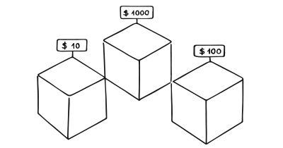
We tend to rely too heavily on the first information presented
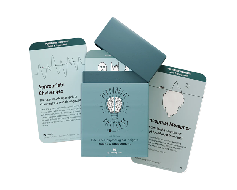
A brainstorming tool packed with tactics from psychology that will help you build lasting habits, facilitate behavioral commitment, build lasting habits, and understand the human mind. It is presented in a manner easily referenced and used as a brainstorming tool.
Get your deck!- Memory Factors in Consumer Choice: A Review by Bettman
- The Xerox Star: a retrospective by Johnson, et. al.
- 10 Usability Heuristics for User Interface Design at Nielsen Norman Group
- Tversky, B. (1973). Encoding processes in recognition and recall. Cognitive Psychology, 5, 275-287.
- Hintzman, D. L., & Curran, T. (1994). Retrieval dynamics of recognition and frequency judgments: Evidence for separate processes of familiarity and recall. Journal of Memory and Language, 33, 1-18.
- Tulving, E. (1983). Elements of Episodic Memory. Oxford: Clarendon Press.
- Roediger, H. L., & McDermott, K. B. (1995). Creating false memories: Remembering words not presented in lists. Journal of Experimental Psychology: Learning, Memory, and Cognition, 21(4), 803.
- Kragel, J., & Polyn, S. M. (2016). Decoding Episodic Retrieval Processes: Frontoparietal and Medial Temporal Lobe Contributions to Free Recall. Journal of Cognitive Neuroscience, 28, 125-139.
