Persuasive Patterns: Facilitation
Limited Choice
We are more likely to make a decision with fewer options to choose from

Limited Choice is a design strategy that simplifies the decision-making process by presenting users with a reduced number of options.
Imagine you’re at a grocery store, standing in front of a shelf filled with 50 different types of pasta sauce. You find yourself overwhelmed, unable to make a decision. You eventually walk away, opting to stick with what you already have at home. This is an example of “choice overload,” a phenomenon where having too many options can lead to decision paralysis and unhappiness (Tang, Hsieh & Chiu, 2017).
Now, you’re also using a streaming service that offers thousands of movies and TV shows. The platform, aware of the pitfalls of choice overload, curates a “Top Picks for You” list, narrowing down your options to 10. You find it much easier to make a selection and feel more confident in your choice. This digital product has effectively utilized the principle of “Limited Choice” to enhance user experience, reducing the cognitive load and increasing decision confidence (Guillet, Mattila & Gao, 2020).
The jam study
One of the most cited studies on the subject of choice is the “Jam Study” conducted by psychologists Sheena Iyengar and Mark Lepper. In this experiment, a grocery store table was set up with either 6 or 24 jars of jam. Although more people visited the table with 24 jars, only 3% actually made a purchase. In contrast, 30% of those who visited the table with 6 jars ended up buying a jar of jam. This study highlighted how limiting choices can significantly affect consumer behavior and decision-making.
Iyengar, S. S., & Lepper, M. R. (2000). When choice is demotivating: Can one desire too much of a good thing? Journal of Personality and Social Psychology, 79(6), 995–1006.
The main principle that “Limited Choice” relies on is cognitive load theory, which posits that humans have a limited amount of mental resources available for tasks like decision-making. Reducing the number of options lowers this cognitive load, making it easier to make a decision.
The persuasive technique of presenting Limited Choice focuses on making the decision-making process easier and more efficient for users. By reducing the number of options available, users experience less cognitive load and can make choices more quickly. The technique is particularly beneficial when the objective is to guide users toward completing a specific action, such as making a purchase or selecting a service.
The psychological principle behind “Limited Choice” can be largely attributed to the concept of “analysis paralysis,” a cognitive state where an individual overanalyzes a situation to the point that a decision is never made. This principle is supported by several studies on choice overload and decision-making. For example, research indicates that when presented with too many options, individuals may experience increased cognitive load, leading to decision paralysis and even unhappiness.
The notion of choice overload further supports this. In a state of overload, the individual’s confidence in making a decision decreases as the number of options increases. Essentially, having more choices doesn’t necessarily equate to making better decisions; rather, it can lead to less decisive action and lower satisfaction levels.
Designing products with Limited Choice
When dealing with an exhaustive list of options, it’s beneficial to start by categorizing these options into broader groups to provide a hierarchical structure that makes navigation easier for the user. Categories help people to process a large number of options without feeling overwhelmed.
Once your categories are set, consider implementing smart defaults or pre-selected options within these groups. Fewer options typically lead to more engagement and fewer bounced users. By employing defaults that cater to the most commonly selected or recommended choices, you help users bypass choice overload. This reduces the cognitive load and speeds up the decision-making process. Remember to choose defaults that serve the user’s best interests to ensure ethical application.
Progressive disclosure is a technique where only essential information is provided upfront, with more detailed options available upon user request. This technique aligns well with the aim to reduce cognitive load. Providing a simplified initial view prevents overwhelming users and offers them the choice to delve into more details if they wish. This is particularly effective in multi-step processes like online checkouts.
Timing matters. Don’t present all critical decisions at once. Space out the decisions that a user has to make, especially in processes that require multiple steps. Just like in online checkouts, where choices range from shipping options to payment methods, breaking down the decision-making process into smaller, digestible parts can reduce analysis paralysis.
In digital spaces, use algorithms that adapt based on user behavior. Amazon uses this technique to provide personalized recommendations. Algorithms can filter out irrelevant options, thereby reducing the number of choices presented to the user. Make sure that this process is transparent, so users know their behavior is shaping their experience.
While it may be tempting to add more features for the sake of differentiation, it’s essential to assess the tradeoffs between feature richness and simplicity. As per the psychology behind decision-making, too many options or features can deter users from making a choice. Be cautious of not only the number but also the complexity of features added.
Simplicity usually wins
Users prefer a path of least resistance, and every additional option or feature introduced adds to their cognitive load. This not only leads to decision fatigue but also increases the likelihood of errors and misunderstandings. Prioritize simplicity over complexity to enhance user engagement and satisfaction.
Ethical recommendations
The Limited Choice pattern has the potential to be misused in several ways. One common form of misuse is the deliberate restriction of options to those that serve the interests of the provider at the expense of the consumer. For instance, a healthcare provider might limit the display of insurance options to only those that it has partnerships with, thereby curtailing the consumer’s ability to make an informed decision. Additionally, limiting choices can create an illusion of scarcity or exclusivity, coercing individuals to make decisions they might not have made under different circumstances.
Another potential issue is that of ‘false choices,’ where the options presented are limited but essentially lead to the same outcome. This can be manipulative, giving users the perception of choice where there is none. In more extreme cases, Limited Choice could be used to steer vulnerable populations toward decisions that are not in their best interest, such as high-interest loan schemes or unbeneficial healthcare plans.
To apply the Limited Choice pattern ethically, make sure that you follow these guidelines:
- Transparency
Make it clear why options are limited and on what basis. If there are other choices available that you are not presenting, acknowledge this openly. - User benefit
Always ensure that the limitations serve the user’s interest as much as they serve the business. The choices presented should offer distinct advantages and disadvantages and be geared toward different user needs. - Inclusion of expert advice
For complex decisions like healthcare or financial planning, providing access to expert advice alongside limited choices can help users make more informed decisions. - External validation
Where possible, allow for external reviews, social proof, or verification to demonstrate that the limited choices provided are not serving to mislead or take advantage of users.
Real life Limited Choice examples
Tinder
On the Tinder app, users are presented with one profile at a time, instead of multiple profiles to choose from. This simplifies the process, making it easier to focus and make a decision on whether to swipe left or right. The limited presentation avoids cognitive overload, allowing for a more straightforward and quicker decision-making process.
Zara
Unlike many other retailers that offer a wide range of products, Zara focuses on a limited collection that rotates frequently. By doing so, it not only simplifies choices for customers but also creates a sense of urgency to make a purchase before items are replaced. Ethically, they maintain a high standard of quality to ensure that customers are getting value from their limited selections.
Apple
Apple keeps a relatively streamlined product line, avoiding the introduction of too many similar products that could confuse consumers. By offering a limited choice, they make it easier for customers to decide what to buy based on their needs. The simplified choice architecture aids consumers in making confident purchasing decisions.
Trigger Questions
- Are we overwhelming the user with too many choices?
- Have we tested the optimum number of choices for our specific user base?
- What is the core value we are offering, and how can limited choices enhance this value?
- Are the limited choices presented truly the best or most popular options?
- Are we transparent about how choices are curated or limited?
- Does the limitation of choices align with ethical considerations and benefit the user?
Pairings
Limited Choice + Picture Superiority Effect
While Limited Choice minimizes cognitive load by reducing the number of options, the Picture Superiority Effect helps in quicker information processing and better recall through the use of images. When employing this strategy, it’s crucial to use images that are consistent in style and size. They should aim to either summarize or support the text-based information and should be designed in a way that they align well with the limited text. This helps in preserving the advantage of reduced cognitive load offered by the Limited Choice pattern while leveraging the benefits of quicker information processing through the Picture Superiority Effect.

We are more likely to make a decision with fewer options to choose from
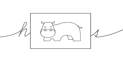
We remember images much better than words
Limited Choice + Loss Aversion
Limited Choice reduces the cognitive load associated with making a decision, while Loss Aversion taps into the natural tendency to prefer avoiding losses over acquiring gains. This can be especially impactful in new markets or for technologies that people are not yet familiar with. For new product ranges, each product should clearly add distinct value and should be easily comparable to the others in the range. For existing ranges, consider simplification strategies to reduce the cognitive load. Always remember that each extra choice added increases the consumer’s work in making a comparison, which in turn increases loss aversion and reduces confidence in making a choice. So, make your range simple but significant, and you will not only ease decision-making but also build confidence and trust in your brand.

We are more likely to make a decision with fewer options to choose from

Our fear of losing motivates us more than the prospect of gaining
Limited Choice + Scarcity Bias
Offering limited options along with a message that these options are scarce can compel quicker decision-making. Many travel booking sites use this combination, showing only a few available seats or rooms and indicating that they are fast running out.

We are more likely to make a decision with fewer options to choose from

We value something more when it is in short supply
Limited Choice + Framing Effect
Financial investment platforms often offer a limited selection of portfolios that are framed in terms of risk (e.g., conservative, balanced, aggressive). The limited choice makes it easier to pick one, while the framing helps users align their choice with their risk tolerance.

We are more likely to make a decision with fewer options to choose from

The way a fact is presented greatly alters our judgment and decisions
Limited Choice + Chunking
This pairing is effective in multi-step processes like online checkouts. By using chunking to divide the process into smaller parts and offering limited choices at each step, users are likely to find the overall task less daunting. For example, in airline booking websites, users first choose the flight, then the seat, and finally additional options like meals or baggage. Each choice is simplified and presented in chunks.

We are more likely to make a decision with fewer options to choose from
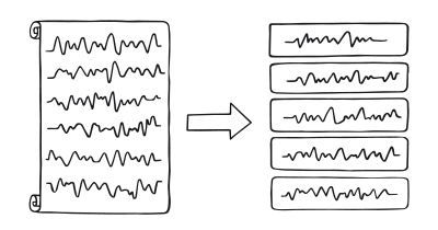
We process and remember information grouped into manageable bits more easily
Limited Choice + Status-Quo Bias
Subscription services often use this combination effectively. Users are presented with a limited range of subscription options and once they make a choice, the service auto-renews, playing into the user’s tendency to stick with the status quo.

We are more likely to make a decision with fewer options to choose from
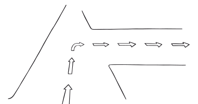
We prefer the current state instead of comparing actual benefits to actual costs
A brainstorming tool packed with tactics from psychology that will help you increase conversions and drive decisions. presented in a manner easily referenced and used as a brainstorming tool.
Get your deck!- More Is Not Always Better: The Benefits of Cognitive Limits by Hertwig & Todd
- When choice is demotivating [ by Iyengar & Lepper
- The Psychology of Choice at Psychology Today
- Schwartz, B. (2004). The Paradox of Choice: Why More Is Less. Harper Perennial.
- Biederman, I. (1987). Recognition-by-components: a theory of human image understanding. Psychol Rev. 1987 Apr;94(2):115-147.
- Norman, D. (1999). Affordance, conventions, and design, Interactions Volume 6, Issue 3, pp 38–43
- Yun-Chia Tang, Yi-Ching Hsieh, & Hung-Chang Chiu. (2017). Purchase decision: does too much choice leave us unhappy? European Journal of Marketing, 51, 1248-1265.
- B. D. Guillet, A. Mattila, & Lisa Gao. (2020). The effects of choice set size and information filtering mechanisms on online hotel booking. International Journal of Hospitality Management, 87, 102379.
- Kahneman, D., & Tversky, A. (1979). Prospect Theory: An Analysis of Decision under Risk. Econometrica, 47(2), 263-291.
- Iyengar, S. S., & Lepper, M. R. (2000). When choice is demotivating: Can one desire too much of a good thing? Journal of Personality and Social Psychology, 79(6), 995-1006.
- Scheibehenne, B., Greifeneder, R., & Todd, P. M. (2010). Can there ever be too many options? A meta-analytic review of choice overload. Journal of Consumer Research, 37(3), 409-425.
- Salecl, R. (2010). The tyranny of choice. London, UK: Profile Books.
- Pozo, V. F., Tonsor, G., & Schroeder, T. (2012). How Choice Experiment Design Affects Estimated Valuation of Use of Gestation Crates. Journal of Agricultural Economics, 63, 639-655.
- Chintakayala, P., Hess, S., Rose, J., & Wardman, M. (2010). Effects of stated choice design dimensions on model estimates.
- O’Keefe, D., & Hoeken, H. (2021). Message Design Choices Don't Make Much Difference to Persuasiveness and Can't Be Counted On—Not Even When Moderating Conditions Are Specified. Frontiers in Psychology, 12.
