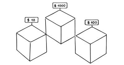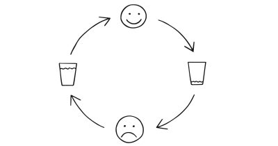
Reduce otherwise complex activities to a few simple steps – or ideally a single step. By making a behavior easier to perform, the ratio between benefit and cost will increase and motivate people to engage in the behavior more frequently.
Imagine a person who wants to start exercising but finds the idea of a one-hour workout overwhelming. A friend suggests breaking it down into smaller, more manageable parts—just five minutes of exercise to start. The person begins with a five-minute jog around the block and gradually works up from there. The simplification of the task into a five-minute commitment makes it easier to start and less intimidating, increasing the likelihood of creating a new exercise habit.
Transitioning from the everyday exercise example, think about a digital personal finance service that initially had a complex dashboard with multiple fields for income, expenditures, savings, investments, and more. Users had to input a wealth of information to get any meaningful insights, which often deterred them from fully utilizing the service. The designers then revamped the platform, focusing on simplification. Now, the application features just a single input field that asks, “What’s your primary financial goal?”
Based on imported bank data, past behavior, and other contextual information, the application then automatically allocates funds to different accounts, suggests investment opportunities, and even predicts monthly expenditures, all aligned with the user’s stated financial goal. By reducing a complex interface into a single input field, the application has significantly increased its user engagement and reduced the cognitive load put upon users. However, while the simplification has made the service more accessible, it also makes choices on behalf of the user. Therefore, transparency about how decisions are made and options to customize should be ethically considered to ensure the user maintains control over their financial decisions.
The paradox of choice
One pivotal study in the field of decision-making explored the paradox of choice: when given too many options, people are less likely to make a decision and, if they do, are often less satisfied with their choice. This research by Barry Schwartz illuminates the principle that sometimes less is more, laying the groundwork for the persuasive pattern of “Reduction.”
Schwartz, B. (2004). The Paradox of Choice: Why More Is Less. New York: Ecco.
The process of Reduction aims to streamline user experience by breaking down complex tasks or reducing the number of steps required to reach a goal. The pattern is often used to assist users in making decisions more quickly or facilitating smoother interactions with a product or service. By minimizing cognitive load and decision fatigue, Reduction enhances usability and can lead to higher conversion rates or user satisfaction.
A study on applying reduction
Imagine you’re in your car, navigating through a bustling city, and you need to find a parking spot. You pull out your smartphone and open a car app. Within seconds, the app not only locates a nearby parking spot but also provides real-time availability and directions. This is the power of “Reduction,” one of the nine persuasive design principles identified in a seminal study by Zhang, Wan, and Min. The study delves into the persuasive design principles of car apps and highlights how “Reduction” can simplify complex tasks, encouraging users to take action. In this context, “Reduction” transforms the often stressful experience of finding a parking spot into a straightforward, manageable task. This principle can be applied in various design contexts to simplify user actions, thereby increasing engagement and effectiveness.
Zhang, C., Wan, L., & Min, D. (2016). Persuasive Design Principles of Car Apps.
The main psychological principle that underpins the “Reduction” pattern is the concept of “Cognitive Load,” which originates from Cognitive Psychology. Cognitive Load Theory suggests that human working memory has a finite capacity, and when overwhelmed with too much information or too many choices, cognitive performance can suffer. By reducing the amount of information or the number of choices a user has to process, you effectively lower their cognitive load, making it easier for them to make decisions and take action.
Designing products with Reduction
The Reduction technique attempts to simplify complex systems for users. It narrows down choices and focuses attention on essential elements, facilitating a streamlined user experience.
One of the primary steps in applying this pattern is to identify the core actions that a user needs to perform while interacting with your product. Once these core actions are pinpointed, the next step is to minimize the number of steps required to complete them.
For instance, consider a form within an application. It’s crucial to evaluate each field and determine its necessity for the intended action. Fields that are not absolutely required should be eliminated, and wherever feasible, pre-fill information based on the user’s history or preferences. This reduces the effort on the user’s part, increasing the likelihood of them completing the form.
The principle of progressive disclosure is another technique that can be incorporated. By only showing additional options as the user interacts with the interface the initial view can be kept clean and the cognitive load reduced.
The Reduction pattern is often about making informed guesses concerning what users will likely prefer, thereby giving the product a clear direction. This is evident in platforms like Amazon and Google, which reduce tasks to simpler forms based on what other users have done or indicated as useful. In the case of Google Search, a complex algorithmic system is hidden behind a single input field, making the experience both efficient and user-friendly. Yet, even as Google strives for efficiency, it also attempts to be transparent about how user data informs search results, highlighting the need for ethical considerations in implementing the Reduction pattern.
Keep it simple, make it easy.
- Reduction based on what other users did
A common way of implementing the principle of reduction, is for a system to make decisions on behalf of the user based on what other users in similar situations decided. - Hide complexity
Simplify activities into something simple and easily understood. The process of hiding complexity can imply removing possible areas of use in order to highlight others. Keep it simple. Make it easy. - Increase benefit/cost ratio
When benefits outweigh friction, the more likely it is that a behavior will be performed. - Apply good defaults
Reducing complex behavior into something more simple can imply providing fewer choices up front for the users. Make informed decisions based on the nature of their visit or what the majority of similar peers would decide. This will allow you to present a valuable result up front that can later be fine-tuned with more details.
Ethical recommendations
While generally aimed at simplifying user choices and actions, this technique can be misused in ways that compromise user autonomy and transparency. For instance, oversimplification can lead to a lack of user control by hiding essential options or information. If too many decisions are made on behalf of the user, it could limit their freedom to make informed choices. In extreme cases, this could even be a form of manipulative design, nudging users toward choices that benefit the service provider rather than the user.
Additionally, Reduction can lead to data privacy concerns. When a service uses past behavioral data to simplify choices, there may be a lack of clarity about how that data is collected and used, potentially leading to ethical breaches.
- User control
Ensure that while simplifying choices, you do not remove essential controls or options that the user should have. The user should always have a clear pathway to access more advanced controls if they choose. - Informed consent
If user data is being used for simplification, make sure that consent is explicitly obtained. It’s crucial to explain how the data will be used and stored. - Data minimization
When using past behavioral data, collect only what is necessary to improve the user experience. Excessive data collection can lead to ethical concerns and potential misuse.
Simplifications should serve to enhance rather than compromise the user’s autonomy and ability to make informed decisions.
Real life Reduction examples
Uber
The ride-sharing app Uber simplifies the process of hailing a cab by reducing it to a few taps on a smartphone. This eliminates the need to call a cab service or stand on the street, making the experience more streamlined.
Amazon
Amazon has implemented the Reduction pattern in its 1-Click Ordering feature. This option allows users to skip several steps usually involved in online shopping, such as reviewing the cart and entering payment details, thus simplifying the purchase process.
Apple
Apple’s Face ID security feature on iPhones reduces the process of unlocking a phone to just looking at it, eliminating the need to remember passwords or codes.
Trigger Questions
- What are the core actions our users need to perform?
- How can we minimize steps without losing essential features?
- What can we pre-fill or automate based on user history?
- How can we ensure transparency while simplifying processes?
- Have we considered the ethical implications of our simplifications?
- What feedback have we gathered from users about these simplifications?
Pairings
Reduction + Limited Choice
While Reduction simplifies complex actions, Limited Choice focuses on reducing the number of options presented to the user. Together, these patterns can create a streamlined user experience. For example, Apple’s App Store combines both by presenting curated choices and simplifying navigation

Simplify complex behavior to simple tasks

We are more likely to make a decision with fewer options to choose from
Reduction + Anchoring Bias
When you simplify choices, you can use Anchoring to present the most favorable option first, thereby influencing subsequent decision-making. Amazon employs this method by listing their recommended products first.

Simplify complex behavior to simple tasks

We tend to rely too heavily on the first information presented
Reduction + Feedback Loops
Reduction can work well with Feedback Loops to provide the user with real-time updates or results, thereby reinforcing the desired behavior. Fitness apps often combine these patterns by simplifying complex health metrics and providing immediate feedback.

Simplify complex behavior to simple tasks

We are influenced by information that provides clarity on our actions
Reduction + Tunneling
Tunneling guides the user through a predefined path, making it easier for them to complete tasks. When paired with Reduction, the user can move through this path with even greater ease.

Simplify complex behavior to simple tasks

Close off detours from a committed journey
Reduction + Priming Effect
Reduction can prepare the user for a specific action, while Priming can help set the user’s mind in a specific direction before that action. For example, Google Search simplifies the search process (Reduction) and often provides auto-suggestions (Priming) based on the first few letters typed.

Simplify complex behavior to simple tasks

Decisions are unconsciously shaped by what we have recently experienced
A brainstorming tool packed with tactics from psychology that will help you build lasting habits, facilitate behavioral commitment, build lasting habits, and understand the human mind. It is presented in a manner easily referenced and used as a brainstorming tool.
Get your deck!- Persuasive Technology: Using Computers to Change What We Think and Do by Fogg
- The persuasive process by Cockcroft & Cockcroft
- Schwartz, B. (2004). The Paradox of Choice: Why More Is Less. New York: Ecco.
- Zhang, C., Wan, L., & Min, D. (2016). Persuasive Design Principles of Car Apps. DOI: 10.1007/978-3-319-39426-8_31
- Thaler, R. H., & Sunstein, C. R. (2008). Nudge: Improving decisions about health, wealth, and happiness. Yale University Press.
- Sweller, J. (1988). Cognitive load during problem solving: Effects on learning. Cognitive Science, 12(2), 257-285.
- Fogg, B. J. (2009). A behavior model for persuasive design. In Proceedings of the 4th International Conference on Persuasive Technology (Persuasive '09) (pp. 1–7). Association for Computing Machinery
