Persuasive Patterns: Demonstration, Facilitation
Tunneling
Close off detours from a committed journey

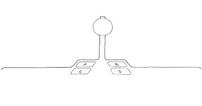
Tunneling guides users through a decision-making process or experience by eliminating unnecessary features that could distract from task completion, while maintaining their sense of control.
Imagine you’re at a grocery store, and you’ve just finished picking up all the items on your shopping list. You head to the checkout lane, where you’re guided by barriers on either side, leading you towards the cashier. Along this narrow pathway, you encounter strategically placed items—gum, magazines, and small snacks. The setup is such that you’re almost compelled to pick up an extra item or two before you reach the cashier. This is a classic example of tunneling, where the environment is designed to guide you towards a specific action, in this case, making an impulse purchase.
Now, let’s consider a digital application designed for project management. When a new user signs up, they are not immediately thrown into a complex dashboard with multiple features. Instead, they are guided through a series of steps—creating their first project, adding team members, setting deadlines, and so on. Each step is presented in isolation, ensuring the user completes it before moving on to the next. This tunneling approach helps the user get acquainted with the application’s features without feeling overwhelmed, thereby increasing the likelihood of continued usage.
The study
BJ Fogg has extensively discussed how tunneling can guide users through a predetermined sequence of actions or events, thereby influencing their behavior. Imagine a simple scenario: you’re navigating through an online course platform. The design of the platform guides you through a series of steps—first, you choose a course, then you’re led to watch an introductory video, followed by a prompt to complete a quiz. Each step is designed to keep you engaged and to lead you toward a specific outcome, in this case, course completion. This is tunneling at work, a design pattern that leverages the psychology of persuasion to guide user behavior.
Fogg, B. J. (2003). Persuasive technology: using computers to change what we think and do. Morgan Kaufmann Publishers.
The concept of “Tunneling” was popularized by BJ Fogg in his seminal work “Persuasive Technology: Using Computers to Change What We Think and Do” in 2002. Fogg’s work laid the foundation for understanding how technology can be designed to influence human behavior.
The primary goal of this pattern is to simplify the process of task completion or decision-making for the user by reducing distractions and focusing their attention on a narrow set of actions. This allows for easier navigation and better engagement, thus increasing the likelihood of the user completing a desired action. The potential of this pattern is significant, especially in applications that require a user to follow a series of steps to reach a goal, such as making a purchase, completing a survey, or setting up a profile.
The underlying psychological principle of tunneling is “Cognitive Load Theory,” which posits that human cognition has a limited capacity for processing information. By reducing extraneous cognitive load, tunneling allows users to focus on the task at hand, thereby improving decision-making and task completion.
This pattern leverages the psychological principle of “commitment and consistency,” where individuals are more likely to continue a course of action once they have made an initial commitment. By guiding users through a “tunnel” of steps, the design encourages them to complete a task or achieve a goal, making the experience more engaging and effective.
Designing products with Tunneling
The principle of tunneling offers a compelling framework for designers aiming to guide users through a specific journey, whether it’s completing an online purchase or navigating through a software application. However, the effective application of this principle requires a nuanced understanding of its potential and limitations.
One of the key aspects of tunneling is the simplification of the user journey. According to a study by Smith and Johnson, reducing the number of steps in an online checkout process can significantly improve conversion rates. This aligns well with the essence of tunneling, which aims to guide users through a series of well-defined steps toward a specific outcome. By eliminating unnecessary steps or decisions, designers can reduce cognitive load and friction, making it easier for users to reach their goals.
However, simplification should not be taken to the extreme. Essential information or options that the user may need should not be omitted in the name of streamlining. For instance, in an online checkout process, while reducing steps can improve conversion, omitting options like “Apply a Promo Code” or “Choose a Delivery Option” could lead to user frustration and cart abandonment. Therefore, the challenge lies in finding the right balance between simplification and the provision of necessary information.
Designers must be cautious not to overuse tunneling, as it can lead to an overly rigid user experience. Users should still feel they have control over their actions and decisions. The tunnel should serve as a guide, not a constraint. It should close off detours from the desired behavior without taking away the user’s sense of control.
Tunneling is not just about leading users through a predetermined sequence of actions; it’s also about exposing them to information and activities they might not have engaged with otherwise. This provides opportunities for persuasion but should be done ethically and transparently.
Ethical recommendations
The tunneling pattern poses certain ethical risks if misapplied. One of the primary concerns is the potential for manipulation. By streamlining the user journey and reducing cognitive load, tunneling can make it easier for designers to guide users toward actions that may not be in their best interest. For example, an online shopping platform could use tunneling to expedite the checkout process, subtly discouraging users from reviewing their orders or considering additional options. This could lead to impulsive buying and later regret.
Another ethical concern is the potential for information omission. In the quest to simplify and guide, essential information that the user needs to make an informed decision might be left out. This could be particularly problematic in contexts that involve financial transactions or data sharing, where the user should be fully aware of all the implications of their actions.
By adhering to these best practices, designers can utilize the tunneling pattern in a manner that is both effective and ethical, creating user experiences that are not only persuasive but also respectful of user autonomy and informed decision-making:
- Transparency
Always be transparent about the steps involved in the tunnel and what each step entails. This will allow users to understand what is expected of them and what the outcomes of each action are. - Informed consent
Make sure that all essential information is presented clearly and accessibly, enabling users to make informed decisions. If a step in the tunnel involves financial transactions or data sharing, explicit consent should be obtained. - User control
While the tunneling pattern is designed to guide behavior, it should not remove agency from the user. Options to exit the tunnel, review previous steps, or reconsider decisions should always be available. - Ethical persuasion
Use the tunnel to guide users toward actions that are beneficial to them and align with their goals. Avoid using the pattern to exploit psychological biases or to lead users into making decisions against their interests.
Real life Tunneling examples
Typeform
By showing one question at a time and having a progress bar, Typeform utilizes tunneling to improve the form completion rate.
TurboTax
The software guides users step-by-step through the complex process of filing taxes, minimizing distractions and focusing on one task at a time.
Amazon
Amazon utilizes the tunneling pattern by offering a one-click checkout option, guiding users directly from product selection to purchase.
Trigger Questions
- Are we maintaining user autonomy while simplifying the process?
- What are the essential steps or decisions that should be in the tunnel?
- How can we make the tunnel transparent and trustworthy?
- Is there a clear exit or opt-out strategy within the tunnel?
- Are we respecting ethical considerations such as full disclosure and no coercion?
Pairings
Tunneling + Serial Positioning Effect
In a multi-step tunnel, strategically placing the most critical steps or decisions at the beginning and end, where they’re most likely to be remembered, can increase effectiveness. This combination is evident in online checkout processes where essential options and upsells are presented early or late but not in the middle.

Close off detours from a committed journey

We remember the first and last items in a list better
Tunneling + Feedback Loops
Tunnels can integrate feedback loops to provide real-time updates on user progress. For example, Duolingo not only guides users through lessons but also gives immediate feedback, enhancing both focus and motivation.

Close off detours from a committed journey

We are influenced by information that provides clarity on our actions
Tunneling + Anchoring Bias
In financial or pricing decisions, setting an anchor early in the tunnel can influence decisions made later. This is common in subscription models where a “most popular” option is presented first.

Close off detours from a committed journey

We tend to rely too heavily on the first information presented
Tunneling + Autonomy Bias
Offering some element of choice within the tunnel can make users feel in control, countering the constrictive feeling a tunnel might otherwise generate. For example, Amazon’s one-click checkout still allows users to choose among saved addresses and payment methods, maintaining a sense of autonomy.

Close off detours from a committed journey

We strive to feel in control
A brainstorming tool packed with tactics from psychology that will help you build lasting habits, facilitate behavioral commitment, build lasting habits, and understand the human mind. It is presented in a manner easily referenced and used as a brainstorming tool.
Get your deck!- Persuasive Technology: Using Computers to Change What We Think and Do by Fogg
- Facilitating collaborative design [ by Jalowski, et. al.
- Fogg, B. J. (2002). Persuasive Technology: Using Computers to Change What We Think and Do. Morgan Kaufmann Publishers.
- Jalowski, Fritzsche & Moeslein (2019). Facilitating collaborative design: a toolkit for integrating persuasive technologies in design activities. Procedia CIRP.
- Smith, J., & Johnson, K. L. (2005). The effect of simplification in online checkout processes on conversion rates. Journal of Consumer Behavior, 10(2), 123-137.
- Miller, G. A. (1956). The Magical Number Seven, Plus or Minus Two: Some Limits on Our Capacity for Processing Information. Psychological Review, 63(2), 81–97.
- Engelbertink, M., Geboers, E., & de Groot, R. (2020). Evaluating the value of persuasive technology and the role of teachers in a blended learning course for social work students. Social Work Education, 39(2), 141-155.
- Hamari, J., Koivisto, J., & Pakkanen, T. (2014). Do Persuasive Technologies Persuade? - A Review of Empirical Studies. In A. Spagnolli, L. Chittaro, & L. Gamberini (Eds.), Persuasive Technology (pp. 118-136). Springer.
- Ferebee, S. (2010). Successful Persuasive Technology for Behavior Reduction: Mapping to Fogg's Gray Behavior Grid. In T. Ploug, P. Hasle, & H. Oinas-Kukkonen (Eds.), Persuasive Technology (pp. 88-98). Springer.
- Davis, J. (2009). Design methods for ethical persuasive computing. In Proceedings of the 4th International Conference on Persuasive Technology (Persuasive '09). ACM.
