How: Ask users a functional and a dysfunctional question for each potential feature, map the paired answers to Kano categories, then calculate satisfaction and dissatisfaction indices to rank what to build, improve, or drop.
Why: Kano analysis exposes basic expectations that must be met before customers notice delighters and helps teams balance effort between bug fixes, incremental improvements, and differentiating features.
What is a Kano Analysis?
Kano analysis groups product or service features by the effect they have on customer satisfaction. Introduced by Professor Noriaki Kano in 1984, the model explains why some features raise satisfaction while others merely prevent dissatisfaction.
The Kano categories
Primary categories (most discussed)
- Must‑be (M) — Basic expectations. Their absence causes strong dissatisfaction, but their presence does not raise satisfaction.
- Performance (O) — Also called one‑dimensional. Satisfaction changes in direct proportion to how well the feature works.
- Attractive (A) — Features that increase satisfaction when present but are not missed when absent.
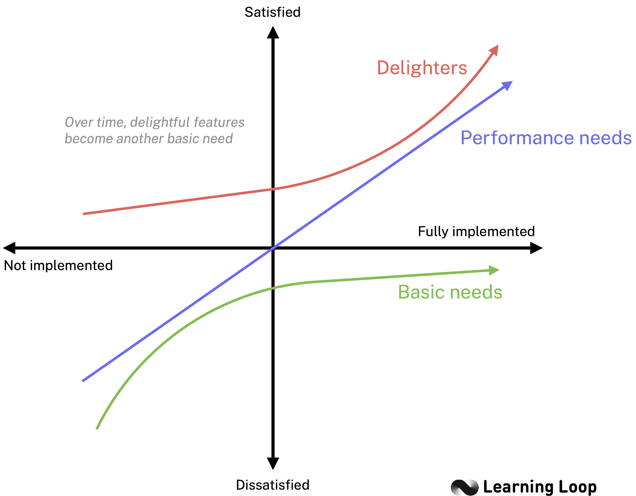
Figure 1 – The Kano Model visualises how customer satisfaction moves for basic, performance, and attractive features as implementation improves.
These three categories usually drive roadmap decisions because they have the clearest and most direct impact on customer adoption and perceived value. They are, however, not static. As Folding Burritos notes, attractive features tend to become performance and eventually must‑be items as technology and user expectations evolve. Treat your Kano snapshot as a moment‑in‑time insight and plan to repeat the analysis periodically.
Secondary categories
- Indifferent (I) — Features that do not influence satisfaction either way.
- Reverse (R) — Some users would prefer the feature not be present.
- Questionable (Q) — Responses were inconsistent; the respondent may have misunderstood the question or feature.
Secondary categories act as signals rather than priorities: postpone or skip Indifferent items, investigate Reverse ratings for root causes, and re‑test Questionable items with clearer wording or qualitative follow‑ups.
Why the categories matter
Focus first on the primary categories: deliver every Must‑be item, optimise Performance features, and consider adding selected Attractive features to raise satisfaction. Use the secondary categories to decide what can be deferred (Indifferent), removed (Reverse), or clarified in the questionnaire (Questionable).
Why use Kano Analysis to plan your roadmap?
Kano analysis does more than reveal potential delight; it also exposes the baseline requirements that must be in place before any delight can register. Behavioural‑economics research on loss aversion shows that users weigh negative experiences more heavily than positive ones. If Must‑be needs are not met, even the most creative features cannot offset the resulting dissatisfaction. By separating Must‑be, Performance, and Attractive needs, Kano helps a team allocate effort in the right order.
Use Kano when you need to:
- Confirm that basic expectations are covered before investing in differentiators.
- Quantify how much incremental work on a Performance feature will lift satisfaction.
- Identify Attractive options that can add perceived value once the essentials are stable.
- Gather fast, survey‑based evidence without forcing users to rank or score features.
When Kano outputs are combined with frameworks that capture business value or implementation cost, the team gains a balanced view. Kano highlights the customer‑satisfaction impact, while scorecards such as ICE or MoSCoW cover feasibility and urgency. The merged view supports more grounded roadmap trade‑offs.
Next, you will learn how to build a concise list of candidate features before writing the survey questions.
How to run a Kano Analysis
The Kano Model can be applied in four practical stages:
- Identify customer expectations by listing and detailing potential product or service attributes.
- Design a Kano questionnaire that pairs functional and dysfunctional questions for each attribute.
- Survey the target market with the questionnaire, choosing an appropriate data‑collection method.
- Analyse and interpret the results to classify attributes and decide roadmap priorities.
The sections below follow this structure.
If you want to go for a lighter version, you can also use our Kano Roadmapping workshop exercise.
Stage 1 – Identify customer expectations
Start by compiling a concise set of potential features or improvements. Keeping the list short ensures that respondents can finish the survey in under ten minutes, which improves data quality.
Collect feature ideas from multiple inputs
Before you write any survey questions, build a well‑rounded inventory of potential features. Draw on as many evidence sources as possible so the Kano questionnaire represents both existing expectations and new ideas under consideration.
- User interviews and feedback – Surface recurring pain points and desired enhancements mentioned by customers.
- Usage analytics – Flag screens or flows where engagement drops or tasks are abandoned.
- Existing product functionality – Review what is already in production to spot gaps, usability issues, or candidates for simplification.
- Internal stakeholder and compliance requirements – Capture obligations from legal, accessibility, or brand teams so they are not missed later.
- Competitive analysis – Note features competitors highlight or user reviews praise.
- Roadmap backlog – Pull ideas that have been suggested but not yet prioritised.
Gathering input from these channels ensures your feature list covers baseline expectations, performance gaps, and potential delighters. It also prevents overlooking compliance‑driven must‑haves or already validated opportunities.
Trim and Group the List
- Merge duplicates – Combine items that solve the same need.
- Describe features at the right level – Focus on user‑visible outcomes rather than technical details.
- Aim for 15–20 items – Large enough to capture variety but small enough to keep the survey manageable.
Write each feature as a short phrase that describes what the user gains, such as “In‑app dark mode” or “Bulk edit for tasks.” Avoid marketing language or vague terms such as “better performance.”
Stage 2 – Design a Kano questionnaire
A Kano questionnaire translates each feature from Stage 1 into two carefully worded questions that measure how customers feel if the feature is present and if it is absent. Keep the wording neutral and the survey short so respondents can complete it without fatigue.
Write the paired questions
For every feature prepare:
- Functional question – “How would you feel if the product has … ?”
- Dysfunctional question – “How would you feel if the product does not have … ?”
Place the functional question first for half of the respondents and second for the other half to reduce order bias.
Sample questionnaire table
Below is a simple worksheet layout you can copy to organise the two questions and the answer scale for each feature.
| Description of feature | Questions | I like it | I expect it | I am neutral | I can live with it | I dislike it |
|---|---|---|---|---|---|---|
| Software documentation integrated into online help | Functional question How would you feel if your system integrated software documentation into the online help feature? | x | ||||
| Dysfunctional question How would you feel if your system did not integrate software documentation into the online help feature? | x | |||||
| (add next feature) | Functional question | |||||
| Dysfunctional question |
Figure 2 – Example worksheet for recording responses to the functional and dysfunctional questions.
Use a standard five‑point Likert answer scale
- I like it that way
- It should be that way
- I am neutral
- I can live with it that way
- I dislike it that way
Avoid changing the labels; the classic scale ensures results can be mapped directly to the Kano evaluation table.
Reinforce emotional framing
The Kano Model captures emotional responses rather than rational cost–benefit trade‑offs. Frame each question around feelings, not utility. “How would you feel if…?” works better than “Would you use…?”
Capture self‑stated importance
Add a third question after each functional/dysfunctional pair: “How important is this feature to you?” Use a 1–9 scale from Not at all important to Extremely important. Importance rankings help separate headline features from nice‑to‑haves.
Show rather than tell (interaction‑based questions)
If you have wireframes or interactive prototypes, let users experience the feature first and then answer the Kano pair. Visual context improves comprehension and reduces wording bias.
Add demographic or segment questions
Include only the segmentation data you plan to analyse. It coudl be user role, company size, or subscription tier. Keep these questions short and place them after the Kano pairs.
Keep the survey concise
- Limit to 15–20 feature pairs plus the importance question so respondents finish in under ten minutes.
- Use progress indicators so respondents know how much is left.
- Randomise feature order to minimise context effects.
- For your first Kano study, Folding Burritos suggests starting with just three key features; you can expand once the team is comfortable interpreting the results.
Choose a survey tool that supports branching
Most general survey platforms work, but purpose‑built options (e.g., Conjointly, Qualtrics, Survalyzer) include pre‑built Kano blocks and automatic scoring. Branching logic lets you alternate question order and show follow‑ups to clarify “Questionable” responses.
Pilot test before launch
Run the questionnaire with 5–10 colleagues or friendly users. Check that question wording is clear and that the survey takes less than ten minutes. Adjust timing, wording, or branching as needed.
Stage 3 – Survey the Target Market
The quality of your results depends on collecting responses from people who accurately represent your user base. Plan recruitment, sample size, and fieldwork procedures before sending the questionnaire.
Decide on sample size and composition
- Minimum per segment – Aim for 30–50 completed sets of answers for each user group you want to analyse. This number is usually enough to stabilise the category distribution.
- Representative mix – Match the share of segments (for example, free versus paid accounts) to your actual or target customer proportions.
Recruit respondents
| Channel | When to use it | Notes |
|---|---|---|
| In‑product or email intercept | You have an active user base | Trigger after a meaningful action; avoid pop‑ups on first use. |
| Customer panels or research communities | You survey users often | Panels allow faster turnaround and controlled quotas. |
| External panel vendors | You need non‑users or a niche audience | Screen carefully to remove inattentive respondents. |
| Social media or newsletter links | You have engaged followers | Use when budget is limited; response quality can vary. |
Offer a small incentive (gift card, extended trial, or donation) if the survey runs longer than five minutes or targets hard‑to‑reach roles.
Written questionnaire vs. standardised interview
Most teams gather Kano data through an online questionnaire, but you can also collect the paired answers in a structured interview. Choose the format that best fits your resources and response‑rate goals.
| Written questionnaire | Standardised interview | |
|---|---|---|
| Advantages | • Low costs • Survey can be conducted online and automated | • Very low dropout rate • Follow‑on or clarification questions can be asked |
| Disadvantages | • Generally low questionnaire return rate | • Interviewer may (unintentionally) influence responses |
Written surveys scale quickly and cost less, but interviews yield richer explanations and almost no drop‑offs. If you have time, consider running a few interviews first to test the wording and then deploy the refined questionnaire at scale.
Stage 4 – Analyse and Interpret the Results
After fieldwork closes, export the raw data and move through four interpretation steps: clean, classify, quantify, and decide.
Clean the response set
- Filter incomplete pairs – Keep only respondents who answered both the functional and dysfunctional question for a feature.
- Remove speeders – Drop entries with unrealistically short completion times.
- Exclude failed attention‑check respondents – Use the control questions set in Stage 3.
Classify each answer pair
Classification converts raw answers into the six Kano categories so you can see which features satisfy basic expectations, which drive delight, and which are largely irrelevant. Without this step the response data is just two columns of numbers—classification turns it into actionable insight.
Map every combination of functional and dysfunctional answers to one of the six Kano categories using the evaluation table below.
| Functional \ Dysfunctional | I like it | It should be that way | I am neutral | I can live with it | I dislike it |
|---|---|---|---|---|---|
| I like it | Q | A | A | A | O |
| It should be that way | R | I | I | I | M |
| I am neutral | R | I | I | I | M |
| I can live with it | R | I | I | I | M |
| I dislike it | R | R | R | R | Q |
Table 3 – Kano evaluation table (Q = Questionable, A = Attractive, O = Performance, M = Must‑Be, I = Indifferent, R = Reverse).
Count how many responses fall into each category for every feature.
Compute satisfaction metrics
Counts alone do not reveal degrees of urgency. By turning category counts into Satisfaction and Dissatisfaction indices you translate qualitative labels into quantitative scores that let you rank features, compare segments, and track changes over time. If you included the importance question, calculate the average importance for each feature; you can later use it as bubble size or an additional ranking column.
Choose discrete or continuous analysis
Folding Burritos distinguishes two analysis levels:
- Discrete analysis – Assign each feature the category with the highest count (mode). Simple and stakeholder‑friendly.
- Continuous analysis (DuMouchel method) – Convert each answer option to a numerical value (from –2 to 4), average functional and dysfunctional scores per feature, and plot them on a two‑dimensional plane. This approach preserves more detail and supports bubble charts where importance controls point size.
Most teams begin with discrete and advance to continuous when they need finer prioritisation.
Visualise the results
Charts help stakeholders grasp patterns faster than tables do. Two visual approaches are common.
The first is the Priority grid based on satisfaction indices that plots Satisfaction on the x‑axis and Dissatisfaction on the y‑axis.\
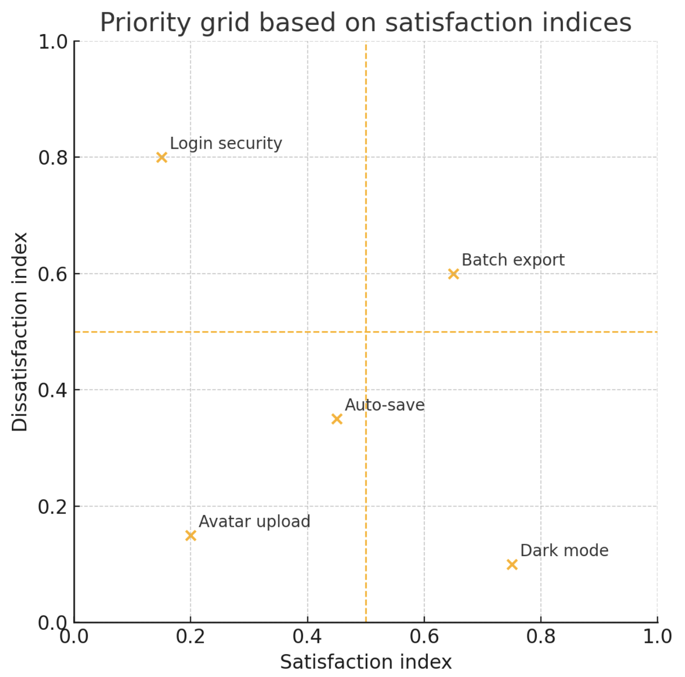
This graph is understood as:
- Top‑left (–x, +y): Must‑Be items to fix first. * Top‑right (+x, +y): Performance items with big impact. * Bottom‑right (+x, –y): Attractive items to differentiate.
Another common way to plot results from the survey is using the Functional vs. Dysfunctional quadrant. It takes the mean score for every functional question (y‑axis) and dysfunctional question (x‑axis) and plot each feature. The four quadrants naturally align with Kano categories:
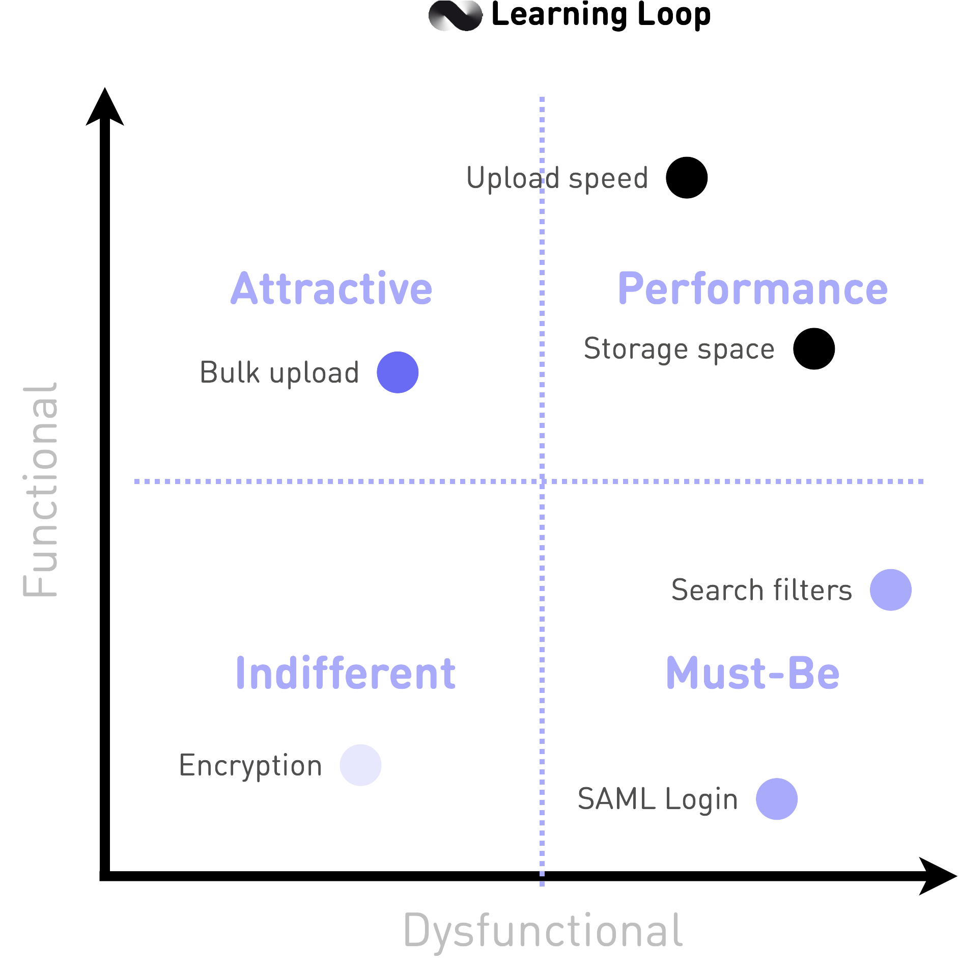
The quadrant should be read like this:
- Upper‑left (high functional, low dysfunctional): Attractive
- Upper‑right (high functional, high dysfunctional): Performance * Lower‑right (low functional, high dysfunctional): Must‑Be * Lower‑left (low functional, low dysfunctional): Indifferen
Complement either scatter plot with a stacked bar chart that shows the percentage breakdown of Kano categories for each feature. The bar view surfaces mixed reactions (e.g., a feature that splits equally between Attractive and Reverse) that a single point on a grid might hide.
Decide roadmap actions
- Address Must‑Be items with high dissatisfaction before working on delighters.
- Sequence Performance items by effort and strategic value.
- Select Attractive items to create competitive advantage once essentials are secure.
- Drop or defer Indifferent items unless they enable another strategic goal.
Document the decisions and link each roadmap item back to its Kano evidence. This traceability helps defend priorities when stakeholder opinions differ.
Getting it right
Even a well‑constructed questionnaire can still fail to deliver clear direction if practical execution stumbles. The checklist below summarises common pitfalls and how to avoid them. Treat it as a pre‑flight inspection before you launch the survey and again when you interpret results.
| Pitfall | How to avoid it |
|---|---|
| Survey is too long | Limit to 15–20 feature pairs and use progress indicators. |
| Vague feature wording | Describe user‑visible outcomes, not technical tasks. |
| Skipping pilot testing | Run a soft launch to catch confusing text and timing issues. |
| Ignoring segment differences | Calculate indices by user role or plan tier if sample size allows. |
| Treating results as permanent | Repeat the study yearly; delights decay into expectations over time. |
| Over‑relying on counts | Use Satisfaction and Dissatisfaction indices to gauge magnitude, not just category modes. |
After each Kano cycle, revisit this checklist. Add your own lessons learned so the process improves with every iteration and fewer issues recur.
Frequently Asked Questions
What is the Kano model
It is a framework that classifies product or service attributes into categories based on how they affect customer satisfaction: Must‑Be, Performance, Attractive, Indifferent, Reverse, and Questionable.
How does Kano analysis work in simple terms
Users answer a pair of questions—how they feel if a feature is present and how they feel if it is absent. The paired answers are mapped to a category using the Kano evaluation table.
Is 30 responses per segment really enough
Thirty complete pairs stabilise category proportions in most surveys. If a feature decision is high‑stakes, aim for more.
Can I mix qualitative interviews with the questionnaire
Yes. Interviews are ideal for exploring why respondents classify a feature in a certain way.
How often should we rerun a Kano analysis
Most teams revisit the survey annually or before a major roadmap reset.
Is the importance question mandatory
No, but it adds nuance and lets you weight features by self‑reported importance.
How do I calculate the Satisfaction and Dissatisfaction indices
Divide the sum of Attractive and Performance counts by the total of A + O + M + I for Satisfaction. For Dissatisfaction, divide the sum of Must‑Be and Performance counts by the same total and add a negative sign.
What tools can I use to run a Kano survey
Qualtrics, Conjointly, Survalyzer, Google Forms, and Typeform all support Kano questions. Choose one that allows branching and easy export.
When should I use Kano analysis instead of NPS or CSAT
Use Kano when you need feature‑level insight. NPS and CSAT measure overall sentiment but do not explain which attributes drive it.
Can Kano analysis be applied to SaaS products
Yes. SaaS teams often use it to prioritise dashboard features, integration options, and onboarding improvements.
How do Kano categories evolve over time
Attractive features often become Performance and then Must‑Be items as user expectations rise. Repeat the survey to track these shifts.
What is Kano analysis used for
Teams apply it to prioritise product features, shape product roadmaps, benchmark against competitors, and identify investment areas that maximise customer satisfaction.
How do I use the Kano model
List potential features, survey users with Kano question pairs, classify the responses, compute satisfaction indices, and use the results to decide which features to build, improve, or drop.
What is Kano analysis in Six Sigma
In Six Sigma projects, Kano analysis appears in the “Define” and “Analyse” phases to identify Critical‑to‑Quality (CTQ) attributes and distinguish basic needs from delighters before process improvements are scoped.
How to use the Kano model in product development
Run a Kano survey at concept stage to ensure Must‑Be requirements are covered, repeat during development to confirm Performance targets, and finish with a final survey after launch to plan future delighters.
How to use the Kano model in product discovery
During discovery sprints, test early concepts with a small Kano sample to spot which ideas promise the highest satisfaction lift relative to effort.
How to use the Kano model to prioritise features
Plot Satisfaction versus Dissatisfaction for each feature, then schedule Must‑Be fixes first, Performance enhancements next, and a few Attractive items for differentiation.
Popular tools
The tools below will help you with the Kano Analysis play.
-
Qualtrics
Ready-made Kano question blocks and automatic scoring
-
Conjointly
Free Excel template and hosted survey logic for Kano studies
-
Survalyzer
Survey platform with built-in Kano evaluation and reporting
-
Google Forms
Lightweight option for quick Kano polls with manual scoring
-
Typeform
Conversational survey flow suitable for shorter Kano studies
Real life Kano Analysis examples
Spotify
Spotify used Kano analysis to identify “Daily Mix” and other personalised playlists as Attractive features, guiding the company to invest heavily in recommendation algorithms.
Source: Personalisation at Spotify
Toyota
Toyota applied the Kano model to distinguish mandatory safety features from Attractive convenience options when planning the Prius redesign.
- Kano model
- Kano Model Explained by Folding Burritos
- Kano Model Reference Guide by The Decision Lab
- Kano Model Guide by Qualtrics
- How Do You Use the Kano Model? by SEEBURGER