Persuasive Patterns: Alert
Centre-Stage Effect
Items positioned centrally are perceived as more important

The Centre-Stage Effect is a cognitive bias in which items positioned centrally are perceived as more important, valuable, or desirable than those placed elsewhere.
The Centre-Stage Effect plays a significant role in guiding consumer decisions and shaping their perceptions. In decision-making, products or options positioned in the center are often seen as the most significant, leading to a higher likelihood of being chosen. This pattern leverages our tendency to focus on what’s immediately in front of us, as well as the association of centrality with prominence.
In product design, the Centre-Stage Effect can influence layout and presentation choices. For example, in e-commerce platforms, centrally placed products may garner more attention and conversions. Similarly, in software design, core features or key actions can be highlighted by positioning them centrally, guiding users towards intended behaviors.
One day, you’re walking by a bakery overflowing with tempting treats. Two displays catch your eye. The first showcases an assortment of pastries arranged randomly on a tray. The second display features a single, spotlight-bathed croissant positioned perfectly in the center. Research by Raghubir & Valenzuela (2009) suggests you’d be more likely to find the centrally displayed croissant more appealing, even if all the pastries are identical. The centre position subconsciously grabs your attention and influences your perception of importance.
The same thing is true as you browse a news website. The homepage layout is meticulously designed. Top headlines scroll dynamically across the top banner, while captivating feature articles occupy the central section. These central articles, often accompanied by high-quality visuals, draw your gaze and likely represent the stories the editors consider most important or newsworthy. This is a digital manifestation of the Centre-Stage Effect, strategically used to capture user attention and guide information consumption.
Just like the bakery display, the central placement in a digital interface subconsciously signals importance. Understanding this effect empowers designers to curate user experiences by strategically placing crucial information or desired user actions within the central focus area.
The study
The Centre-Stage Effect is a well-documented cognitive bias, as highlighted by a seminal study conducted by Valenzuela and Raghubir (2009). The study explored how the placement of options in a visual array affects consumer preferences and decisions. Researchers found that items positioned in the center of a display were significantly more likely to be chosen than those placed on the periphery. This finding illustrates the powerful impact of positioning on decision-making, highlighting the centrality bias.
The study involved a series of experiments in which participants were asked to choose from arrays of products or options, with items systematically varied in their placement. Results showed a consistent preference for the centrally positioned items, even when controlling for other factors such as product quality or features.
Valenzuela, A., & Raghubir, P. (2009). Position-based beliefs: The center-stage effect. Journal of Consumer Psychology, 19(2), 185–196.
The Centre-Stage Effect is a phenomenon where items positioned in the center of our view seem more important or appealing. This effect can be explained through several intuitive concepts:
Our eyes naturally focus on the center of what we see, making centrally placed items more likely to catch our attention. This visual preference is further supported by the fact that the center of our visual field has more photoreceptor cells, making it inherently more noticeable.
Additionally, our brains process information in the center more efficiently than information on the periphery, thanks to direct connections between the central part of the eye and the brain’s visual processing center. This makes centrally placed items easier for us to take in and evaluate.
The Centre-Stage Effect is also influenced by societal norms. We learn to associate central positioning with higher status or value, reinforcing the idea that centrally placed items are more important.
Furthermore, when we see a series of options, we tend to value the first or most prominent one the most. This “focalism” effect shapes how we view other options, leading us to prefer centrally placed items.
The Centre-Stage Effect is a combination of visual preference, cognitive efficiency, societal norms, and our tendency to value the most prominent option. Recognizing this can help designers create more effective and persuasive products and services, ensuring that key elements catch users’ attention and influence their decisions.
Designing products using the Centre-Stage Effect
The Centre-Stage Effect is a simple yet effective tool for guiding user behavior and improving interaction in product design. Here’s how to apply it seamlessly:
By placing essential information, calls to action, or other key elements in the center of the interface, you ensure that they capture immediate attention. For example, a website’s homepage can have a “Sign Up” or “Buy Now” button centrally placed, making it the focal point of user engagement.
By using elements like larger fonts, bold colors, or distinct visual designs, you can make central items stand out more. For instance, in a mobile app, a central navigation menu with larger icons helps guide users to main sections effectively, reducing confusion.
Structure the user’s journey through your digital space so that important steps or choices are centrally presented, guiding them seamlessly. For instance, in an e-commerce checkout flow, centrally placing payment options can reduce cognitive load, helping users make decisions quickly and smoothly.
A symmetrical design can instill a sense of stability and harmony, making the central message feel more significant. For example, in a product detail page, a central product image with balanced surrounding information creates a cohesive presentation.
In digital design, the hero area (often the first visible section) offers prime real estate for important information or visuals. Leveraging this area to showcase essential content or compelling visuals, along with a clear call to action, ensures that users focus on these elements first.
Placing navigation menus centrally at the top or bottom of the interface makes them highly visible and easily accessible. This reduces the likelihood of users getting lost and encourages interaction with key elements.
Centrally positioning featured content, such as flagship products on an e-commerce site or major news stories on a homepage, increases its visibility and engagement. This setup can guide users to interact more with these highlighted elements.
While the centre-stage is crucial, surrounding elements must support it without overwhelming the design. A clean and organized layout, with balanced elements and central focus, provides a comfortable browsing experience, making users more likely to engage.
Ethical recommendations
The Centre-Stage Effect, while powerful in guiding users towards central options, can be exploited unethically in several ways:
Brands might position options with higher profit margins or specific agendas centrally to influence users towards them. This can lead to choices that aren’t necessarily in the user’s best interest. Central positioning can obscure or overshadow better options that aren’t centrally placed. This can mislead users, especially when accompanied by tactics like anchoring or limited choice, creating an illusion of importance around the central option.
Central positioning, coupled with complex design, can overwhelm users. This might lead them to choose the central option out of confusion, rather than informed decision-making, reducing their autonomy.
To ensure the Centre-Stage Effect is applied ethically and in a user-centric manner:
- Be transparent
Clearly communicate the rationale behind central positioning. Explain why specific options are highlighted and how they benefit users, ensuring transparency in the decision-making process. - Offer clear choices
Avoid using central placement to hide alternative options. Present users with a balanced range of choices and ensure all critical information is clearly presented. - Keep user-centricity
Position options centrally that genuinely reflect user needs and preferences, avoiding any manipulative motives. Balance user interests with business goals to maintain trust. - Simplify comparisons
Provide tools such as comparison charts or summaries to help users make informed decisions. This prevents central positioning from overshadowing viable alternatives and fosters balanced decision-making. - Respect user autonomy
The Centre-Stage Effect should enhance the user experience, not disrupt it. Offer clear ways for users to explore alternatives beyond the central option. Make opting out or choosing different options straightforward, empowering users to make informed decisions.
Real life Centre-Stage Effect examples
Apps like Instagram position key navigation options centrally at the bottom of the screen. This central placement improves accessibility and engagement, making core functions easily reachable and increasing time spent on the app.
Airbnb
Airbnb prominently features its “Experiences” category in a central position on its homepage, guiding users toward curated local activities. This center-stage positioning increases engagement with these offerings, expanding Airbnb’s reach beyond accommodations.
Apple
Apple’s website uses the Centre-Stage Effect by centrally highlighting its latest products on the homepage. This positioning draws immediate attention to new releases, ensuring they stand out to visitors and encouraging exploration of the new products’ features.
Trigger Questions
- What are the key elements users need to see first?
- How can we create a clear visual hierarchy with the center as the focal point?
- Does our central placement align with the user's natural information flow through the interface?
- Does the central element effectively guide users towards the desired action or information?
- Are centrally placed items relevant to users, or do they feel forced?
- How can we adapt center-stage elements for different devices?
- Are we avoiding visual clutter in the central area?
Pairings
Centre-Stage Effect + Anchoring Bias
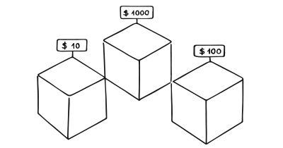
A centrally placed option can be used as an anchor. The first option seen sets a reference point for subsequent comparisons, influencing how users perceive other choices. For instance, in an e-commerce site, a centrally positioned product at a moderate price can make higher-priced items seem more expensive and lower-priced items more affordable.

Items positioned centrally are perceived as more important

We tend to rely too heavily on the first information presented
Centre-Stage Effect + Framing Effect
Positioning items centrally helps frame how users view subsequent options. For example, a SaaS company might centrally position its “Pro” plan, highlighting its features and benefits. This central placement frames the plan as a balanced option, encouraging users to consider it relative to other available choices.

Items positioned centrally are perceived as more important

The way a fact is presented greatly alters our judgment and decisions
Centre-Stage Effect + Priming Effect
Place initial content centrally to shape subsequent user experiences. For example, a travel website may feature a central banner of vacation destinations, priming users to explore related offerings like hotel or flight deals.

Items positioned centrally are perceived as more important

Decisions are unconsciously shaped by what we have recently experienced
Centre-Stage Effect + Limited Choice
The Centre-Stage Effect also works well with the Limited Choice pattern, narrowing users’ focus. By using a balanced and symmetrical layout where only a few central options are featured, the users’ focus is narrowed, cognitive load is minimized, and decision fatigue potentially prevented. This combination makes decision-making more efficient and directs users to primary choices.

Items positioned centrally are perceived as more important

We are more likely to make a decision with fewer options to choose from
Centre-Stage Effect + Decoy Effect
Provide ”’edge options” to nudge better decisions. Adding a decoy option to the edges can nudge users towards the central choice, helping them make better decisions. This can simplify choices and prevent them from being overwhelmed by too many similar options.

Items positioned centrally are perceived as more important

Create a new option that is easy to discard
Centre-Stage Effect + Default Effect
Reduce friction and make the best option effortless. By adding a centralized default choice, you can reduce cognitive load and increase decision speed, particularly for new customers or complex user journeys. This is particularly valuable for users unfamiliar with the products, offering a simple route through a complex choice architecture. Ensure defaults emphasize the middle, best option rather than the most expensive one to maintain user trust and streamline the decision-making process.

Items positioned centrally are perceived as more important

We are more likely to choose a pre-selected option
Centre-Stage Effect + Social Proof
Reinforce the ‘best’ choice with others’ decisions. The Centre-Stage Effect makes middle options seem more popular by default, but this effect can be enhanced by actively supporting it with facts. Highlighting the center option as the top seller or most popular reassures users and reduces choice regret and exhaustive comparisons between unfamiliar options. As users gain more experience, they seek more relevant social proof. For instance, a sports website, knowing a customer is a trail runner, shows a set of five newly released trail running shoes, with the central option highlighted as the most popular among trail runners. The central option and its supporting data can adapt to users’ changing behaviors, providing up-to-date social proof.

Items positioned centrally are perceived as more important

We assume the actions of others in new or unfamiliar situations
A brainstorming tool packed with tactics from psychology that will help you increase conversions and drive decisions. presented in a manner easily referenced and used as a brainstorming tool.
Get your deck!- Environmental context effects on the perceptual judgment of objects [ by Chae & Zhu
- Position-based beliefs: The center-stage effect by Valenzuela & Raghubir
- Valenzuela, A., & Raghubir, P. (2009). Position-based beliefs: The center-stage effect. Journal of Consumer Psychology, 19(2), 185–196.
- Jacoby, J., Lindsay, P. H., & Heslop, L. (1974). Finding pictures in memory: Directed forgetting in picture recognition memory. Journal of Experimental Psychology, 102(1), 123-129.
- Henderson, J. M., & Hollingworth, A. (2009). High-speed eye movements and visual memory when reading sentences and paragraphs. Quarterly Journal of Experimental Psychology, 62(11), 1468-1484.
- Gupta, S., & Zeithaml, V. A. (2006). The impact of position-based visual cues on choice. Journal of Marketing Research, 43(1), 48–61.
- Danziger, S., et al. (2014). Contextual influences on decision-making: The role of placement and framing. Journal of Behavioral Decision Making, 27(2), 179–189.
- Iyengar, S. S., & Lepper, M. R. (2000). When choice is demotivating: Can one desire too much of a good thing? Journal of Personality and Social Psychology, 79(6), 995–1006.
- Thaler, R. H., & Sunstein, C. R. (2008). Nudge: Improving decisions about health, wealth, and happiness. Yale University Press.
